Text description provided by the architects
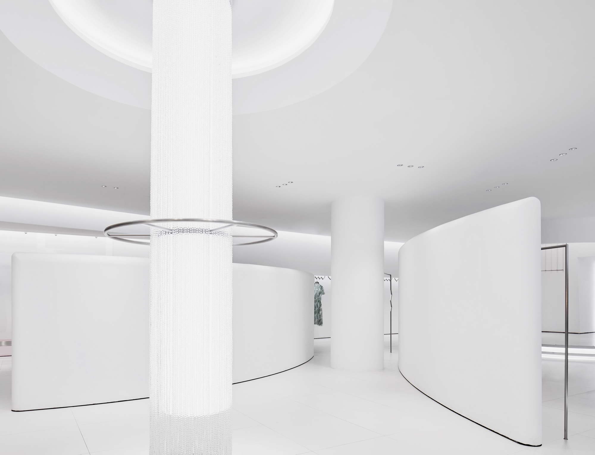
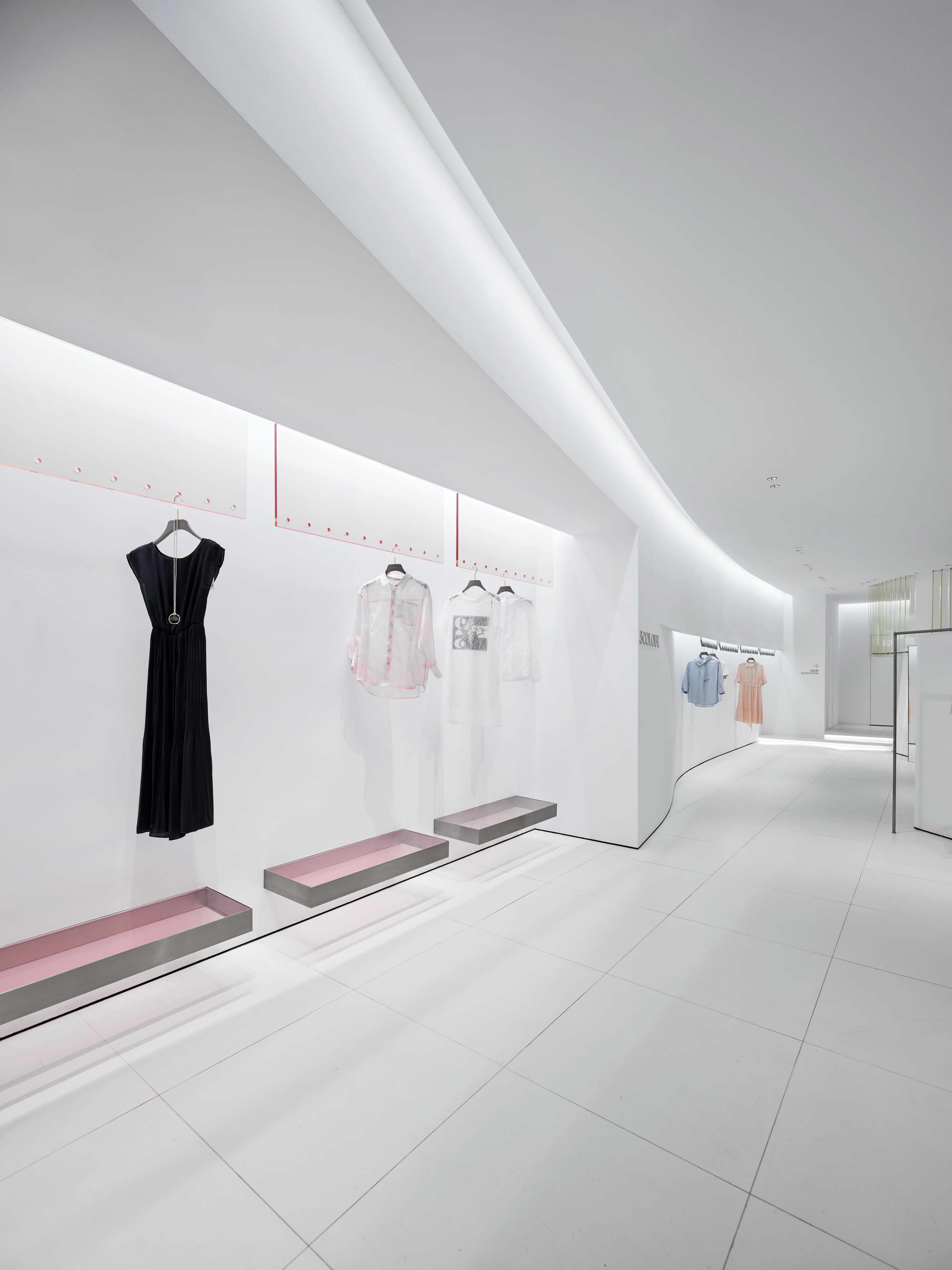
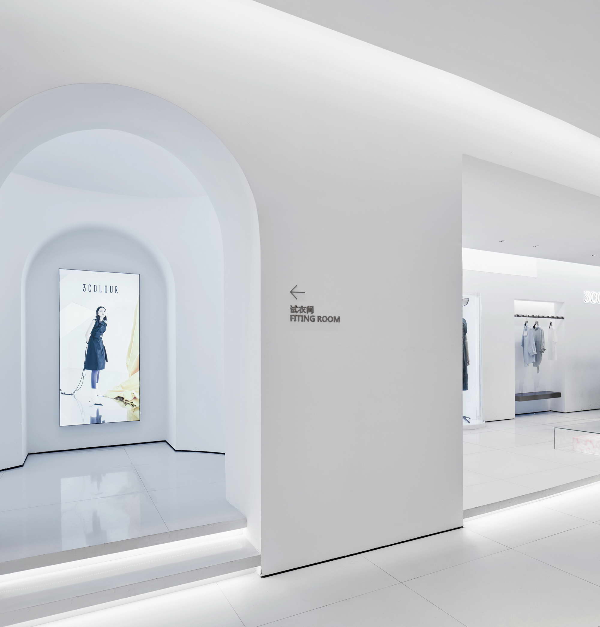
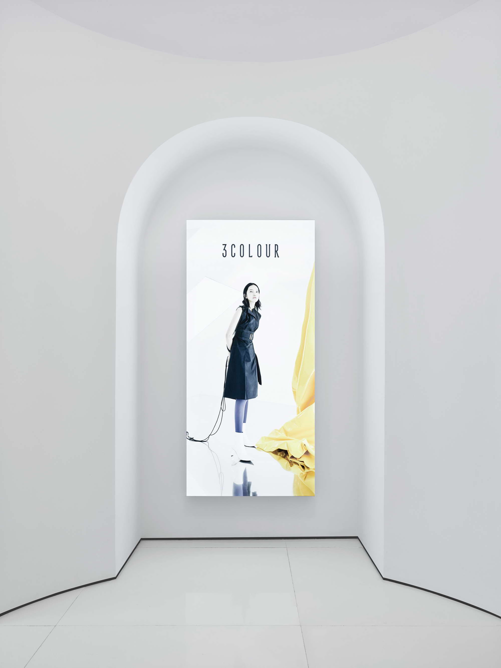
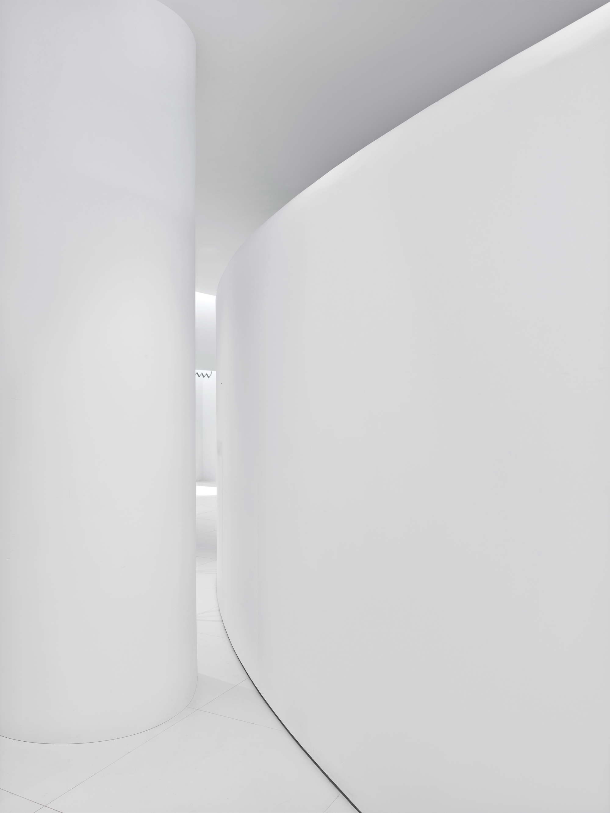
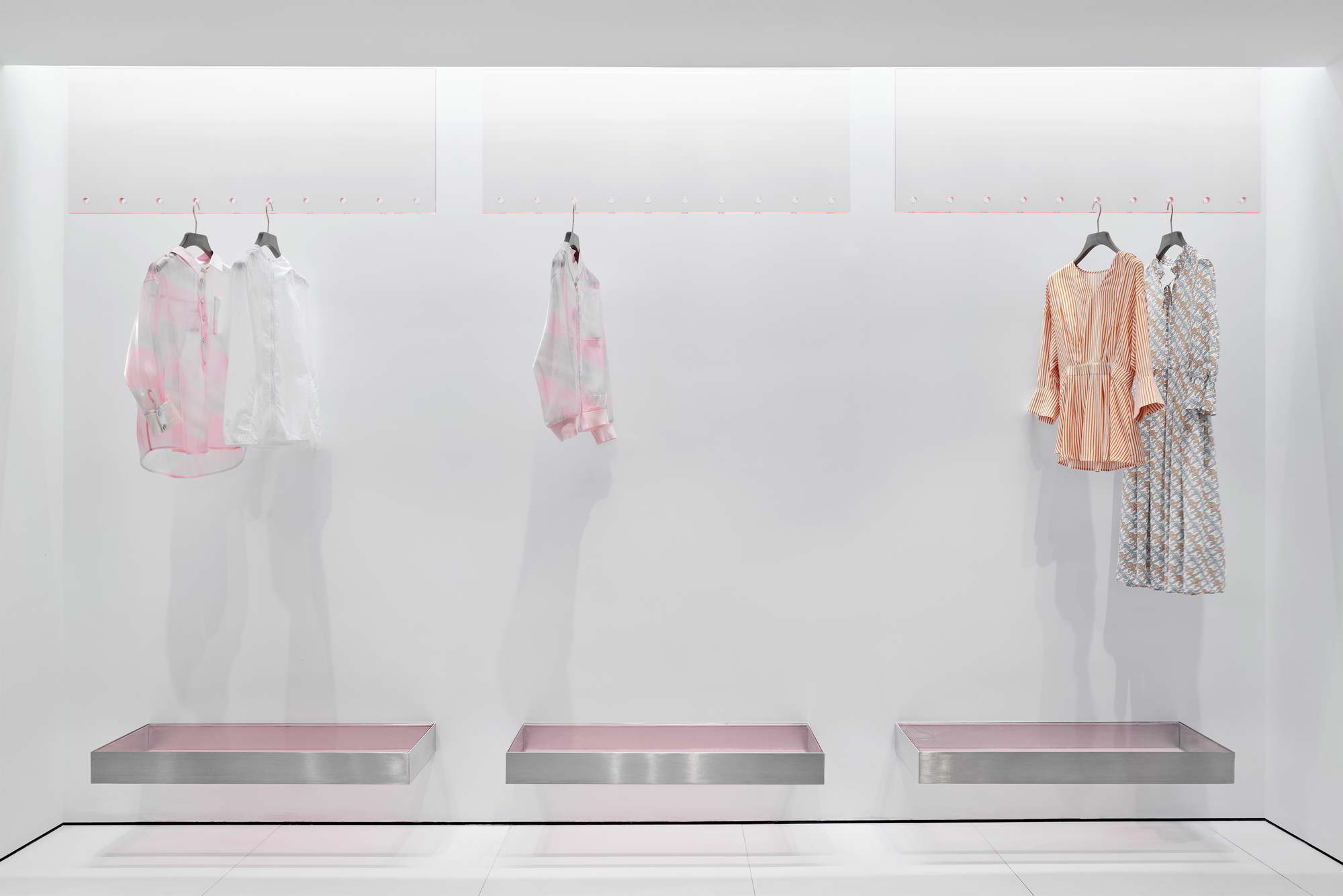
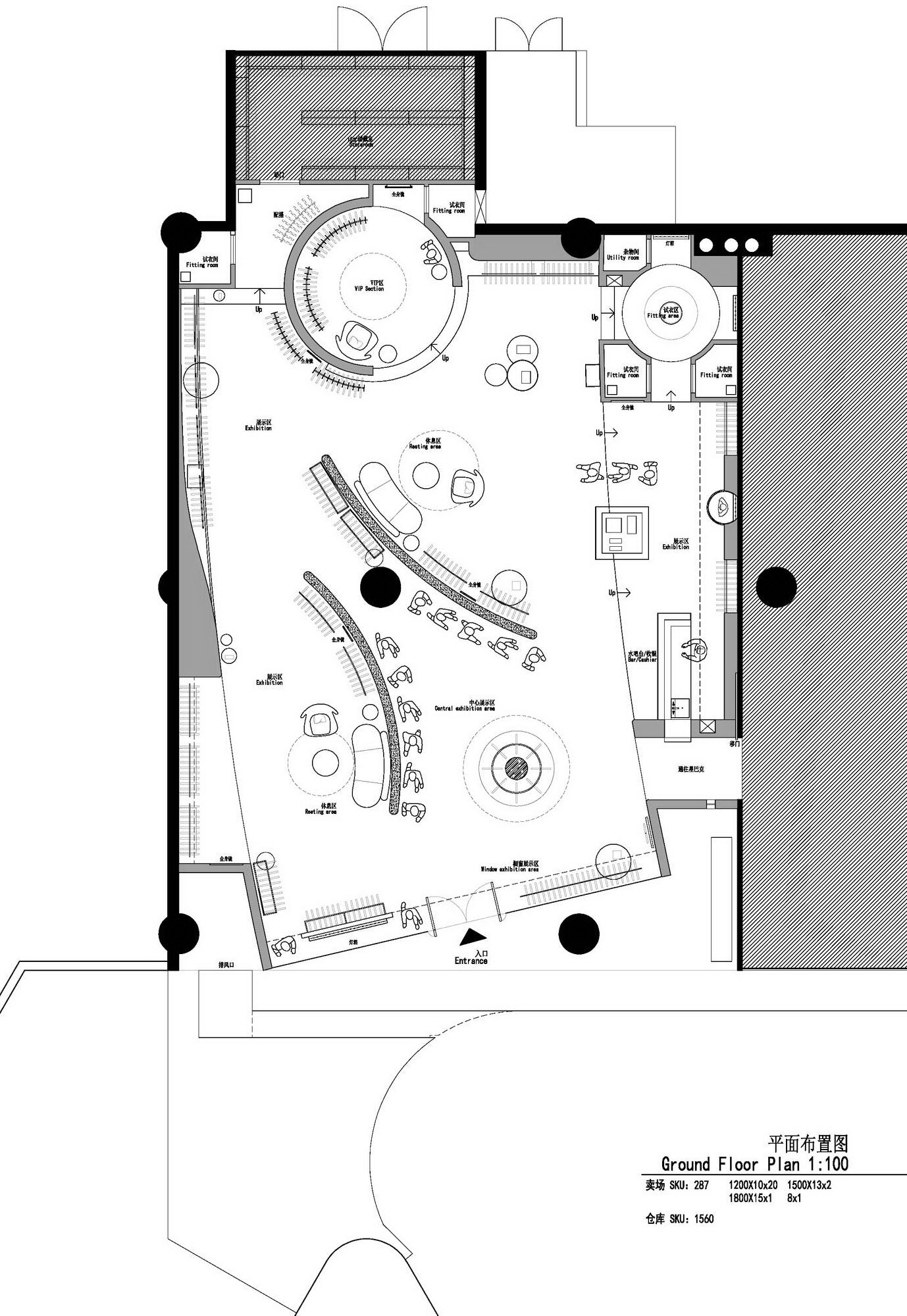
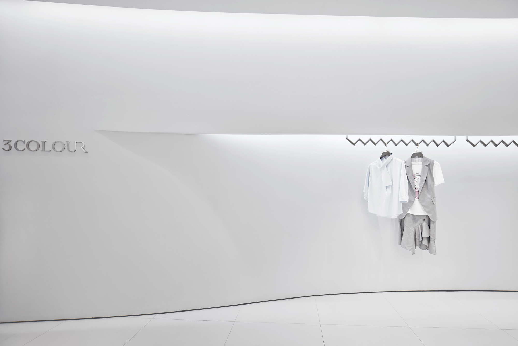
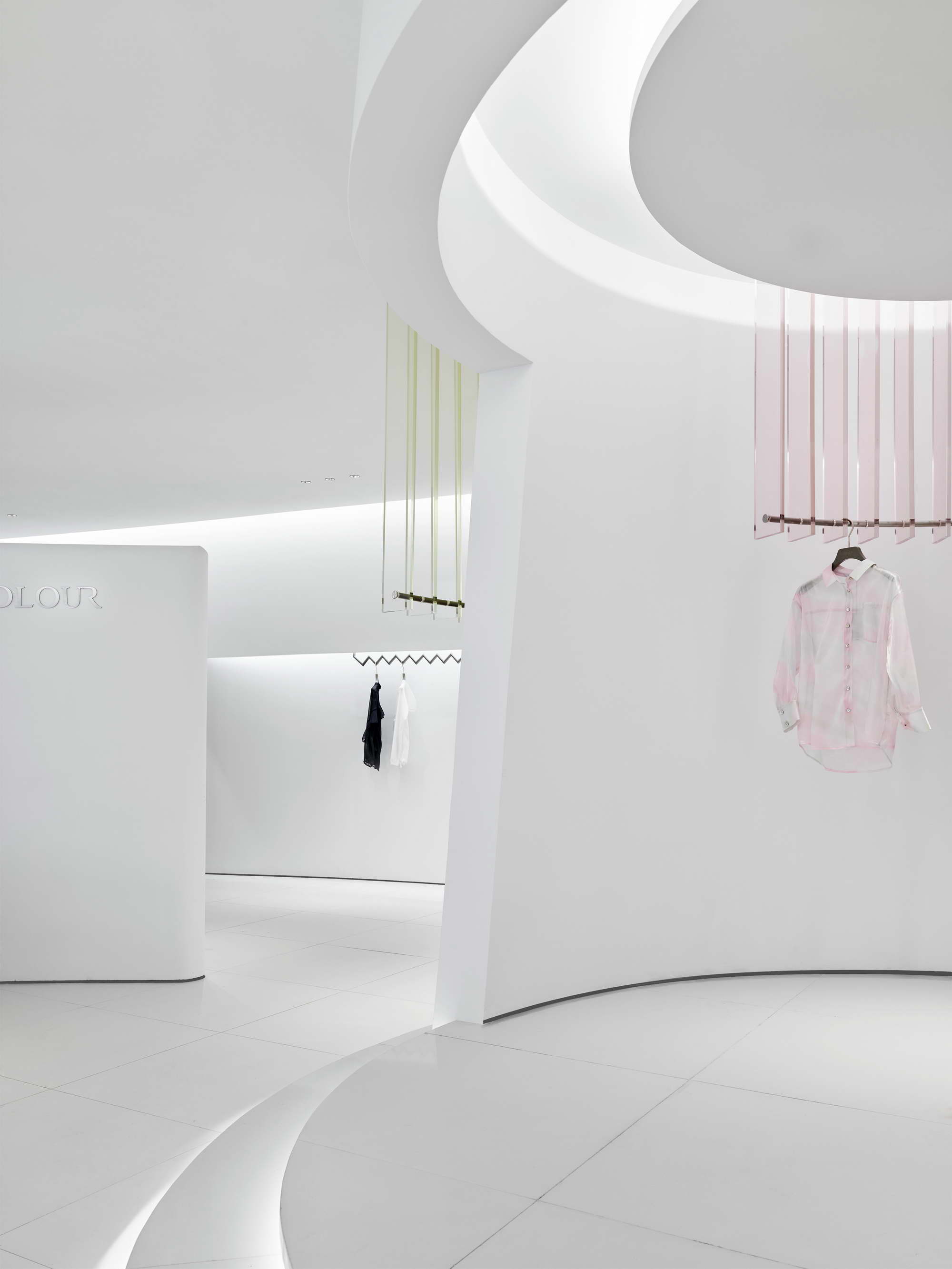
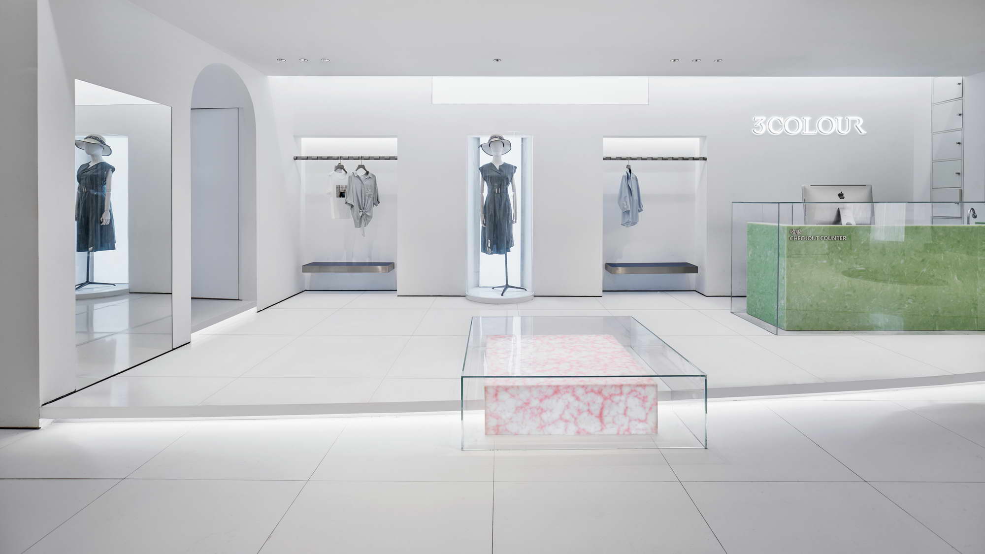
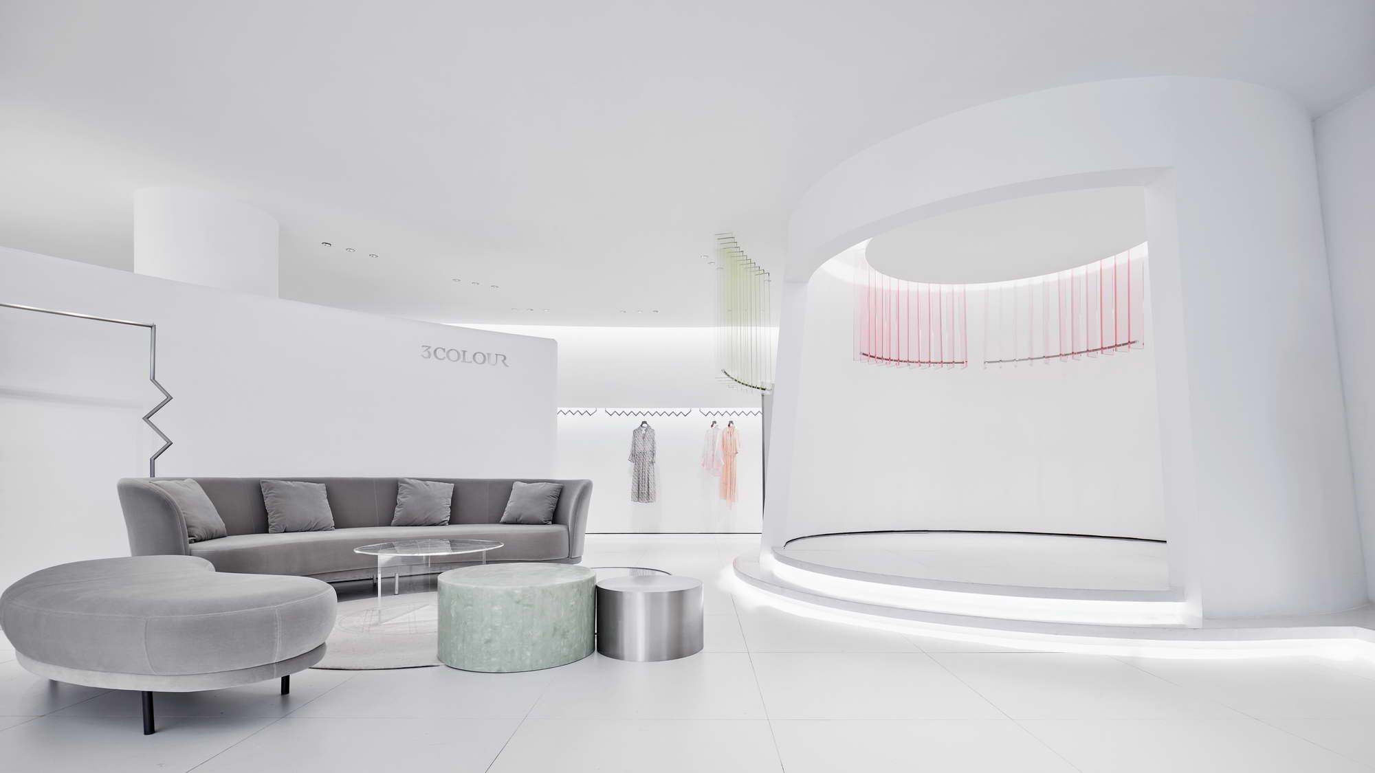
At any time, the temptation of colours to design, and the exploration of colours in design have never stopped. They slyly test each other, seemingly ruled but actually not, subtly pulling our visual nerve endings. ——By SGD Office A few decades ago, the American designer couple Charles and Ray Eames created some new colours like "between red and non-red, black and non-black",and injected them into the Eames Plastic Chair. After the famous architect Le Corbusier experimenting with colours again and again,he created the Weissenhof-Siedlung Houses 14 and 15 and the Marseille apartment in Paris, France. The latter is now a World Heritage Site from 2016,amazing the whole world. The classic colours are still stunning in these days and never been out of date because of the emotions and hints beneath these visual appearances. The degree of colours is so hard to control that without professional manipulation it won’t be performed beautifully or freely. We started ‘3COLOUR’brand’s design with the Three Primary Colours, which is simple, pure and clean. But they can change into thousands of vivid scenes,just like women’s multivariant emotions. The store is all in purest white, and the light is just right to point out where the focus and layers are,picturing a world just like in mirror. With boundaries of space fading away,and reality blurring,everything become so clear, spacious and comfortable. Even if white represents the neutralization energies of all colours, when customers enter, they will still be touched and inevitably take a deep breath. White and silence exists together, it happens so naturally just like water flowing. The real colour game only happens to props and embellishments. The light and transparent Three Primary Colours are like the ripples on the apex of the heart. The warm feeling of light red, the clear feeling of pale yellow,and the fresh feeling of light blue, gradually trigger the customer's mood, clearly and gently. From the pure white environment, the Three Primary Colours to the colourful clothing, the colours are getting thicker, expressing a clear and coordinated theme. The arc-shaped elements can be seen everywhere in the space, just like the most catching curves of women, changing and looming. Between the ceiling and the steps, the circular arc is connected by an incomplete wall, with part of it stay beyond eyesight,leaving us unlimited imagination. Facing with simple designed but beautiful lines,customers will happily realise this long wall of nice dimension is so perfect a place for photographs-taking. In addition,the most worthy part of the store’s design is the door head of the ‘3COLOUR’. Because the store located in the deepest part of the horn-shape building, it should be its weakness. However,we considered of its loopback topography and reversed the door, so that its surface eventually be vertical to the customer's line of sight, maximizing the overall image of "3COLOUR" displayed to everyone. When the customer slowly approachs, inadvertently find an artistic interior space in the secluded path. Under the high door head, the faint colour is smudged, beautiful and light, simple but quite new. I wonder is there someone who can escape from the feeling of such ‘Surprise’?





 Editor's Pick