Text description provided by the architects
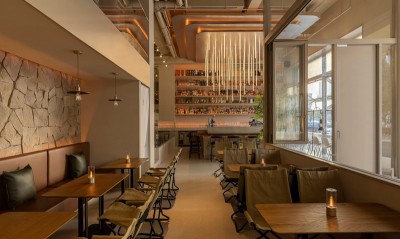
PAIN CHAUD is a French-style bakery settled in Shanghai for eight years. We collaborate closely and designed the sixth store for the brand this year. The project is located in Shanghai ITC International Trade, in the prosperous Xujiahui business district. The large 270-degree curtain wall ensures sufficient daylight and allows visitors to enjoy the open garden landscape. Our initial idea was to enlarge the advantage of the visual field of the site, to meet the basic requirements of the brand, referring to operation and retail, and to introduce a more life-oriented design to the bakery. Entering the ITC shop, you can see the open bar area with an oblique angle, and the continuous bar can effectively guide the flow of people and visual focus. Our design decomposes each function in the store and organizes them into a series of interconnected spaces, meanwhile, these are also independent. The iconic LOGO of the brand is refined into a systematic visual language, which has become a recurring logo in the store. These are elements that we will use and run through in all PAIN CHAUD stores, but we will make adjustments according to the different characteristics of the store. The visual continuity and unity of the space are thus guaranteed. The arcs and semicircles are used as the basic structure to connect different functional partitions, accessing the space to extend naturally while maintaining its order. And through different combinations of geometric shapes to create differentiated visual effects, highlighting the theme of each area. The overall space is divided by a large area of color blocks. While the booth part serves as a rest area, it is also a division of the ordering queue and guest area. The round sofa simulates the fluffy feeling of bread, and it is more comfortable to have a party or a nap here. Fixed small platen and flexible combination of round stool to maximize the space for guests. The long table provides another scenario to expand the mode of single-person use or multi-person discussion and gathering. For creating a more interesting site as well as enriching the spatial character of the brand, we match different design themes into each PC store according to the site conditions. The theme of the ITC store is the Vintage Green in the garden. We hope each guest can breezily enjoy a wide view, sit comfortably, and taste delicious bread and coffee. The overall tone is mainly beige, olive green, and brick red. The old small ceramic tiles, glass lamps, and walls add a new retro meaning. The combination of different lines constructs a space with concise texture and ingenious scale. The retail display spaces are arranged in columns, bars, facades, etc., and are reserved at important nodes of the flow line. The guest area set along the curtain wall is surrounded by a ring to form a small gathering space. We planted evergreen shrubs in this core, hoping to echo with the outdoor large-area lawn garden, creating a garden experience inside and outside. To emphasize the transparency and openness of the space, the curtain wall is not blocked as far as possible, so that the 270-degree open field of vision is retained. The light and shadow change makes the space change more dynamic. With the change of sunlight projection angle, the light presents a variety of features throughout the day, creating a friendly atmosphere of the store.




 Editor's Pick
 Latest Design