Text description provided by the architects
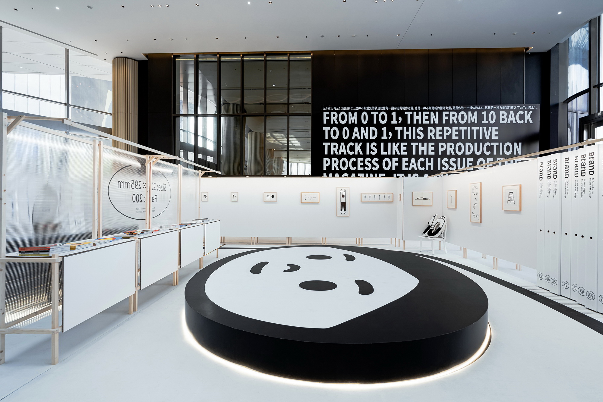
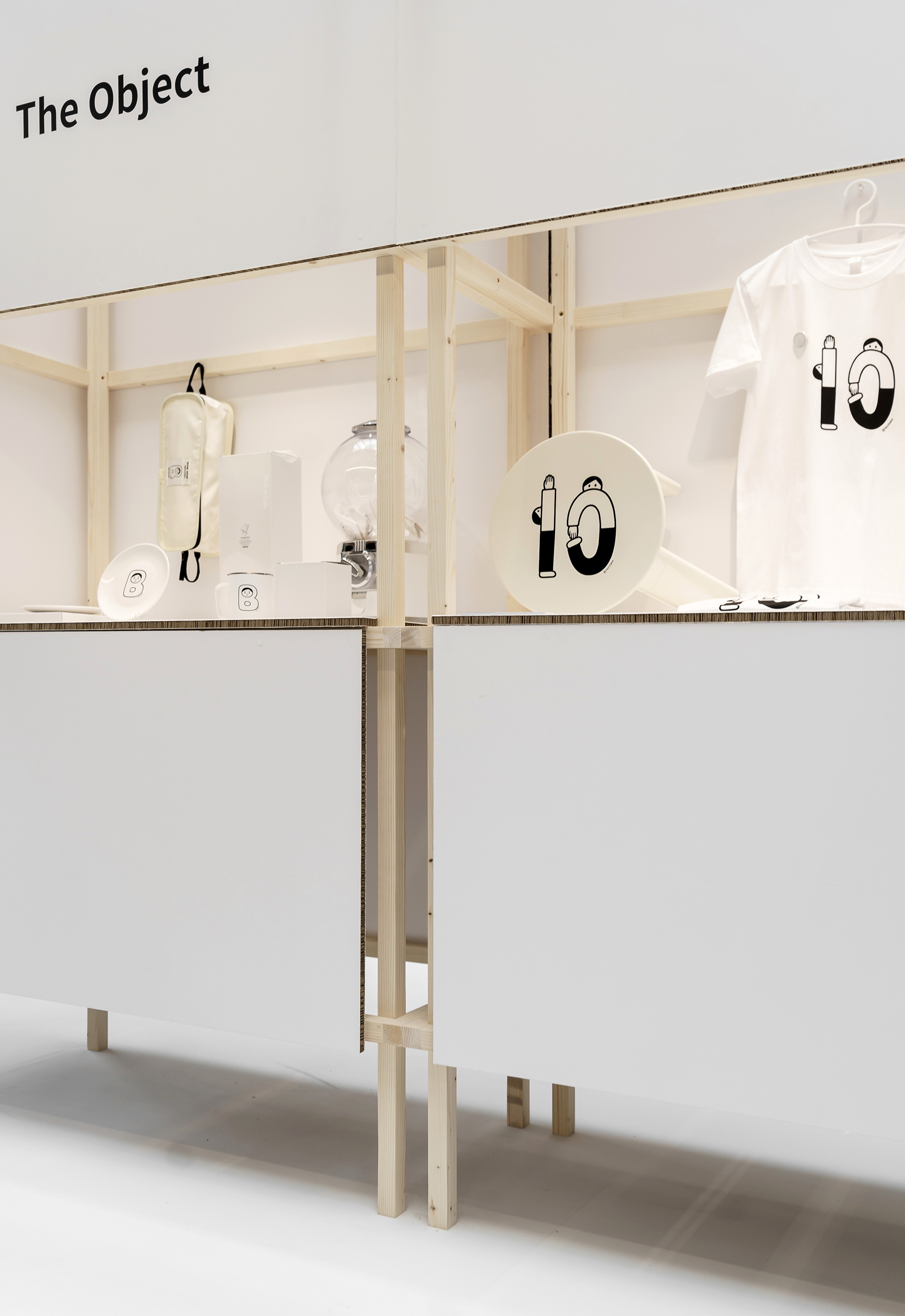
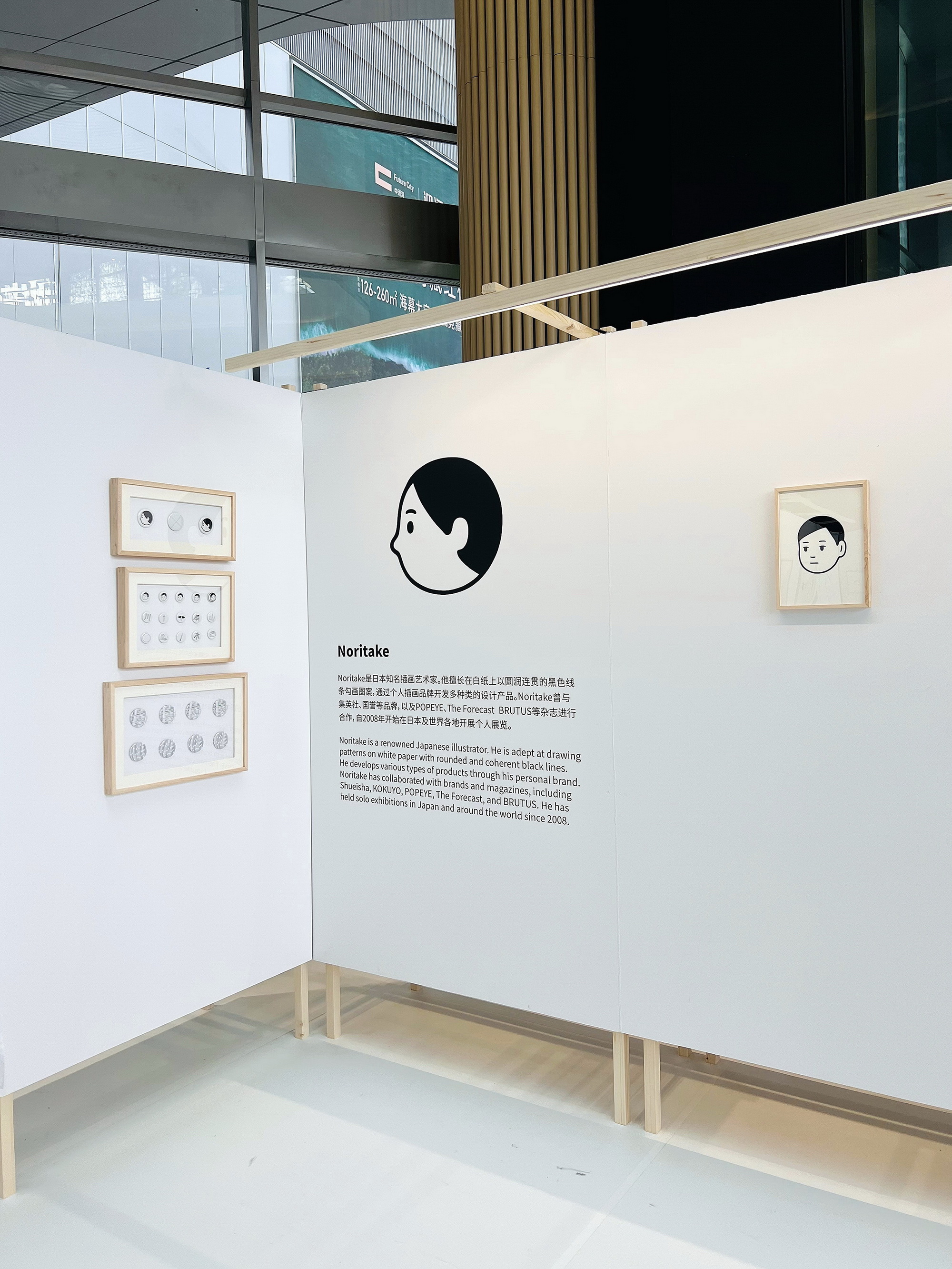
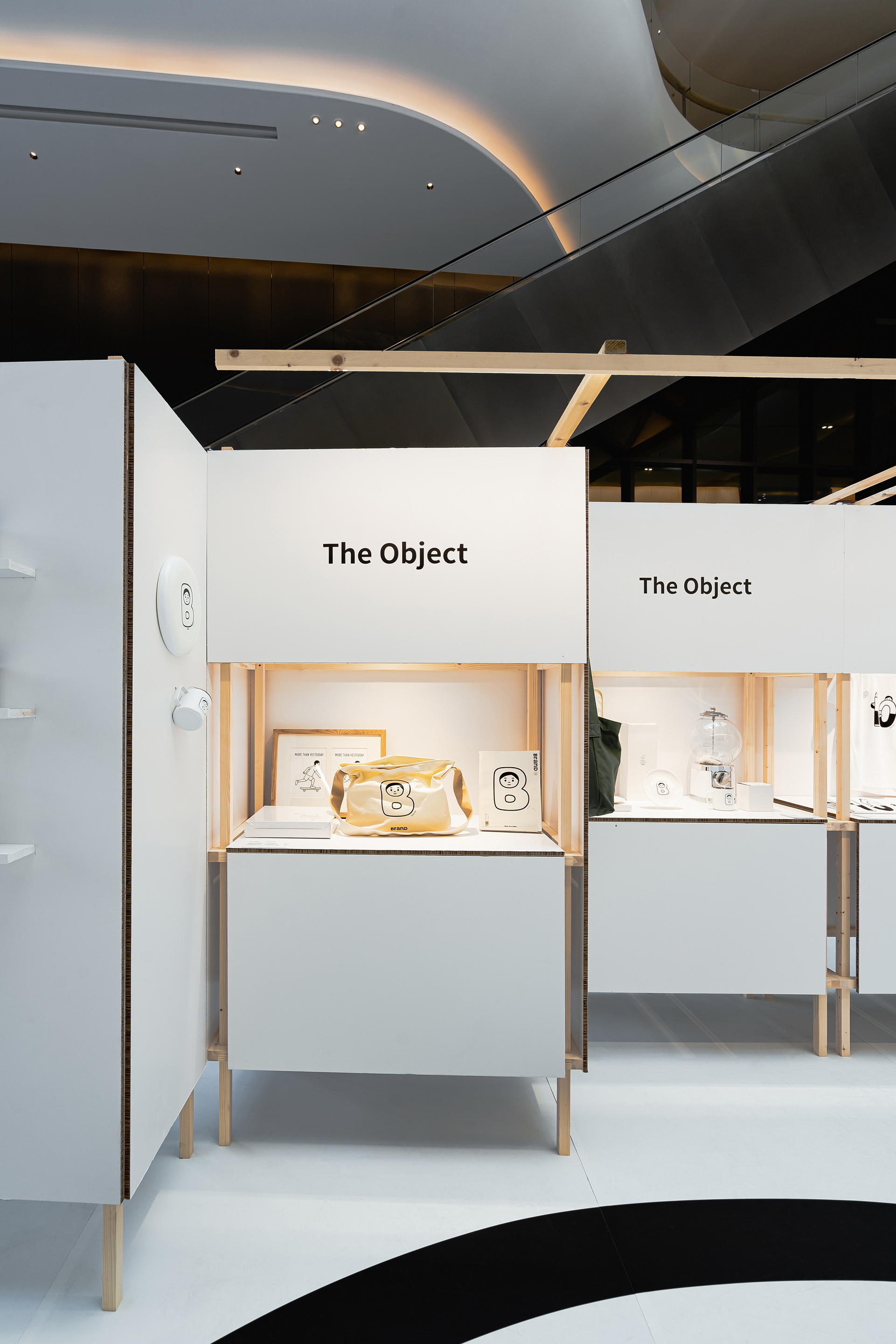
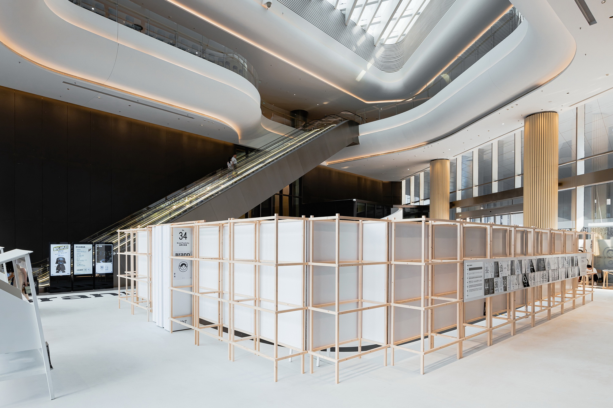
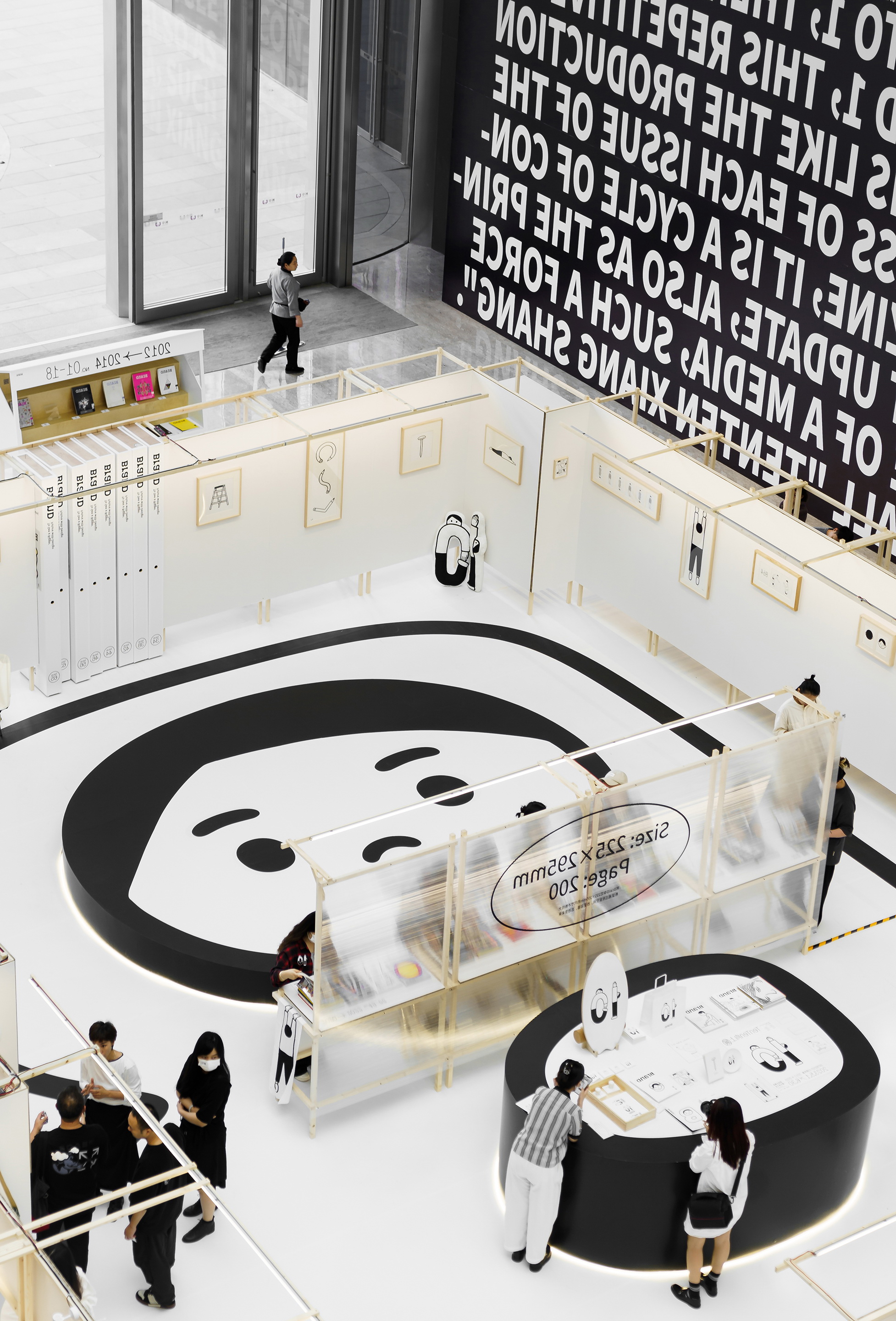
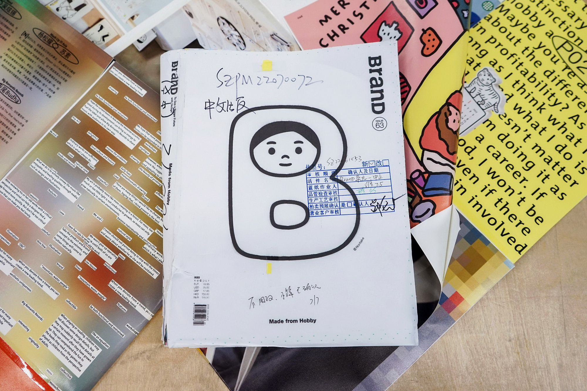
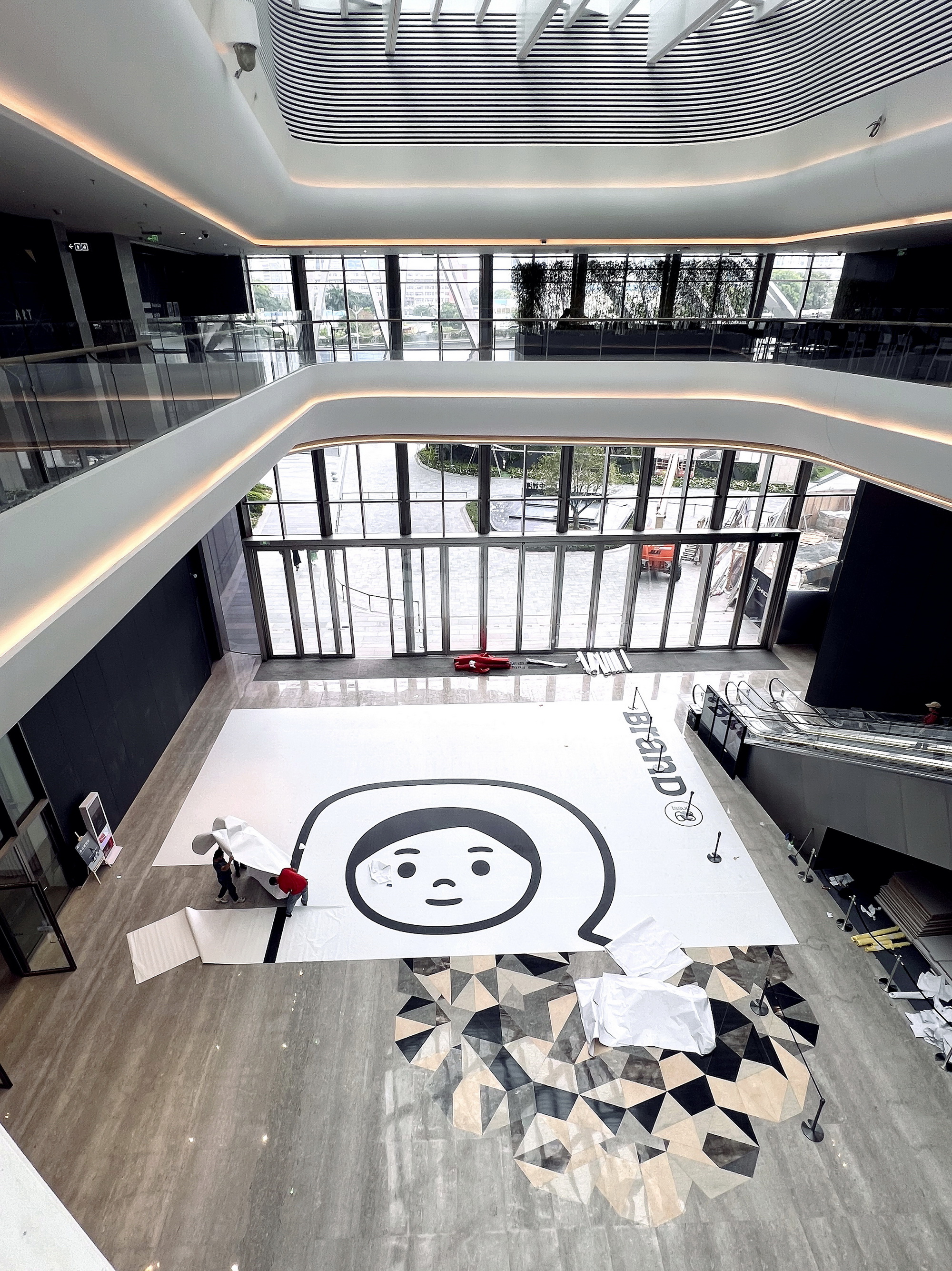
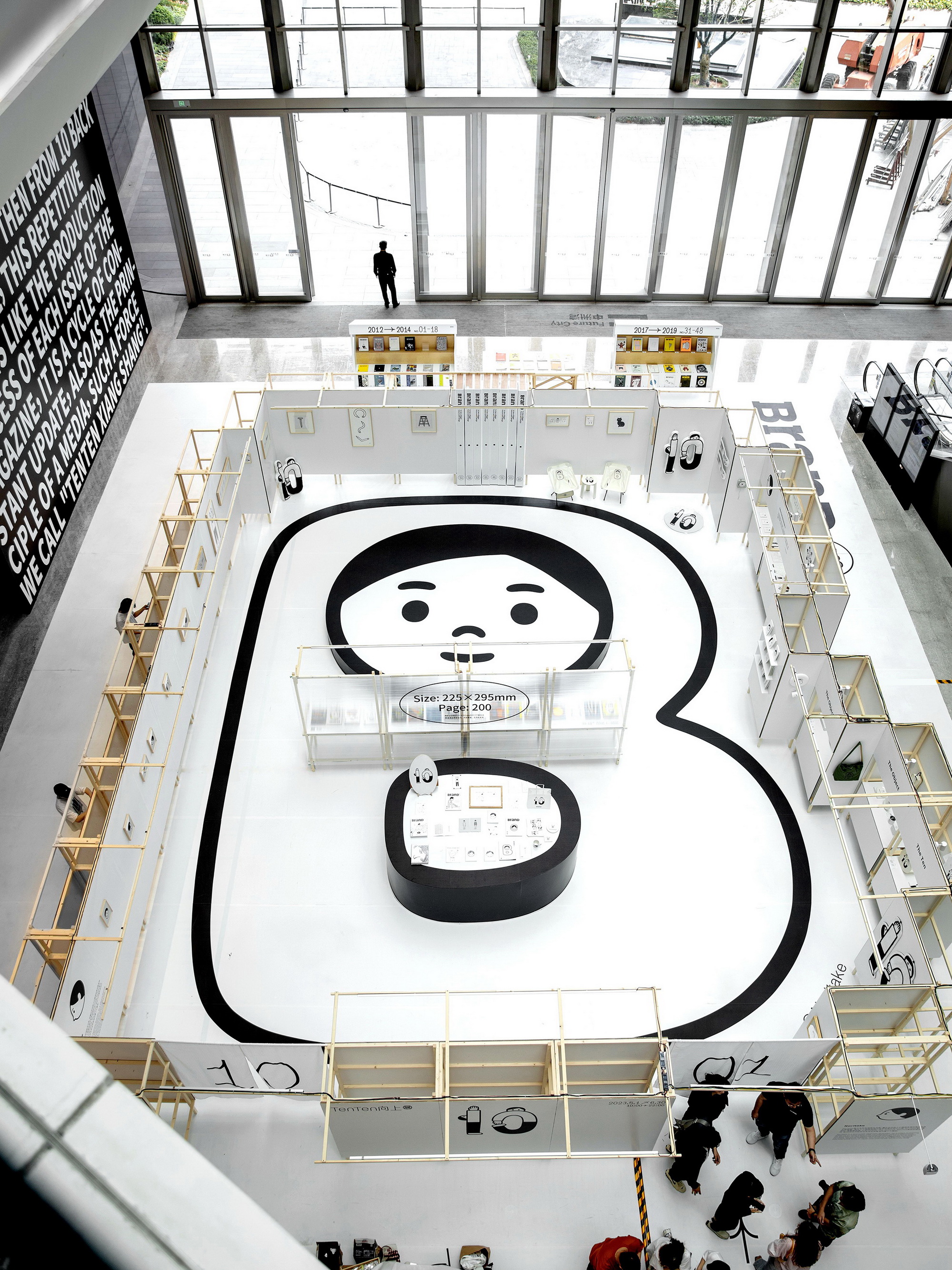
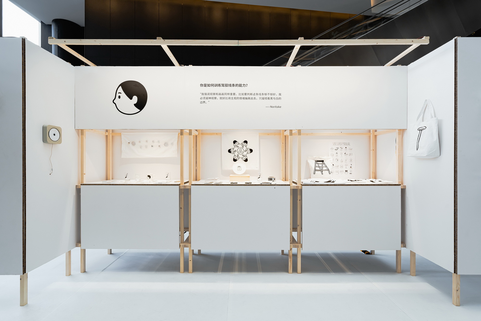
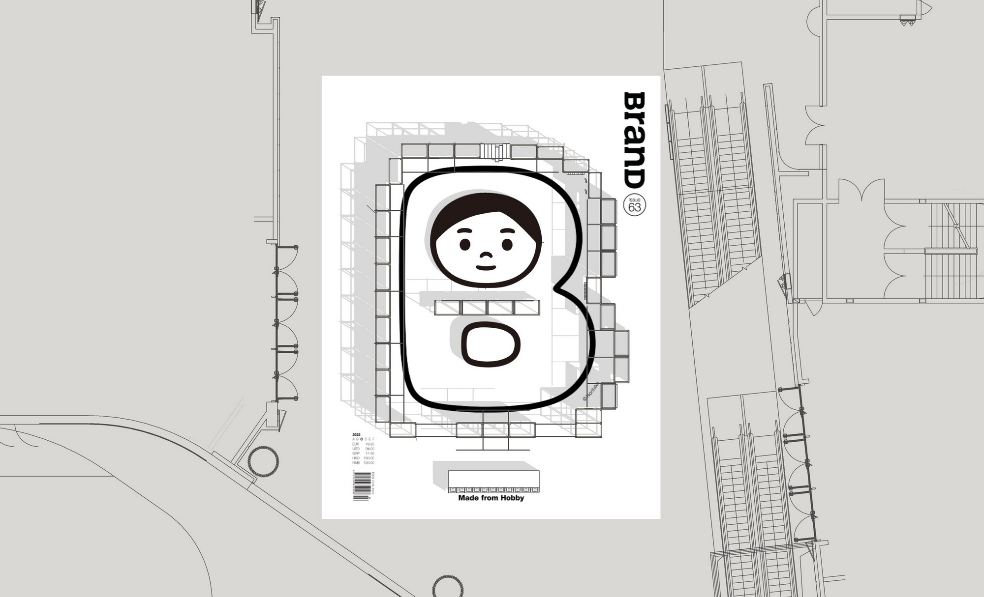
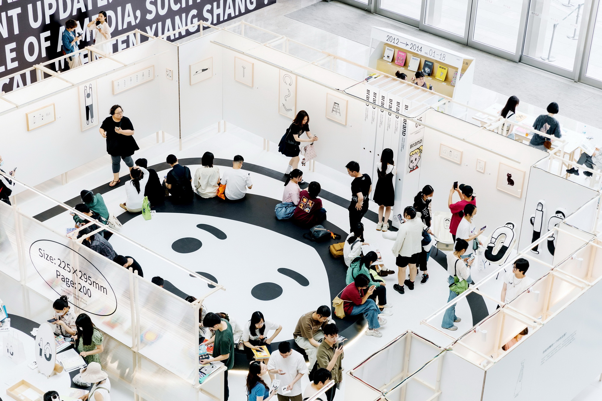
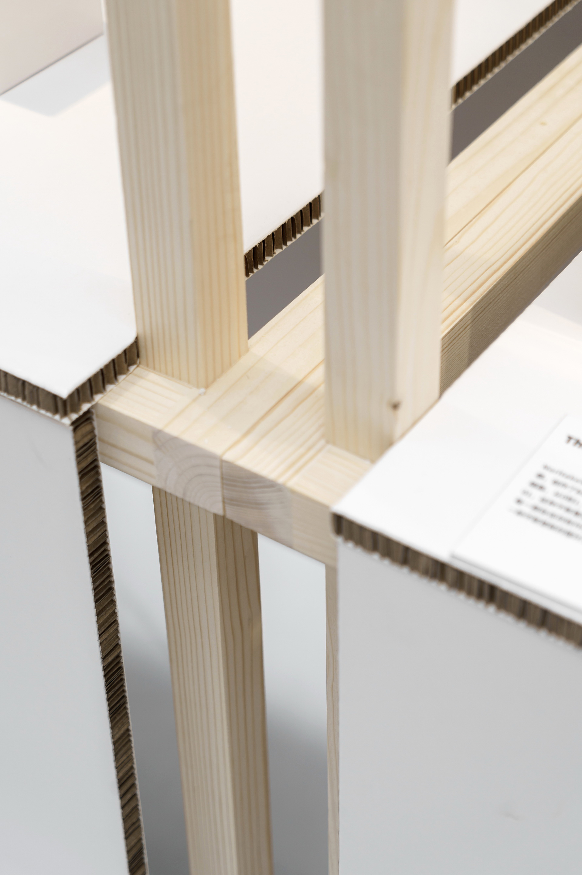
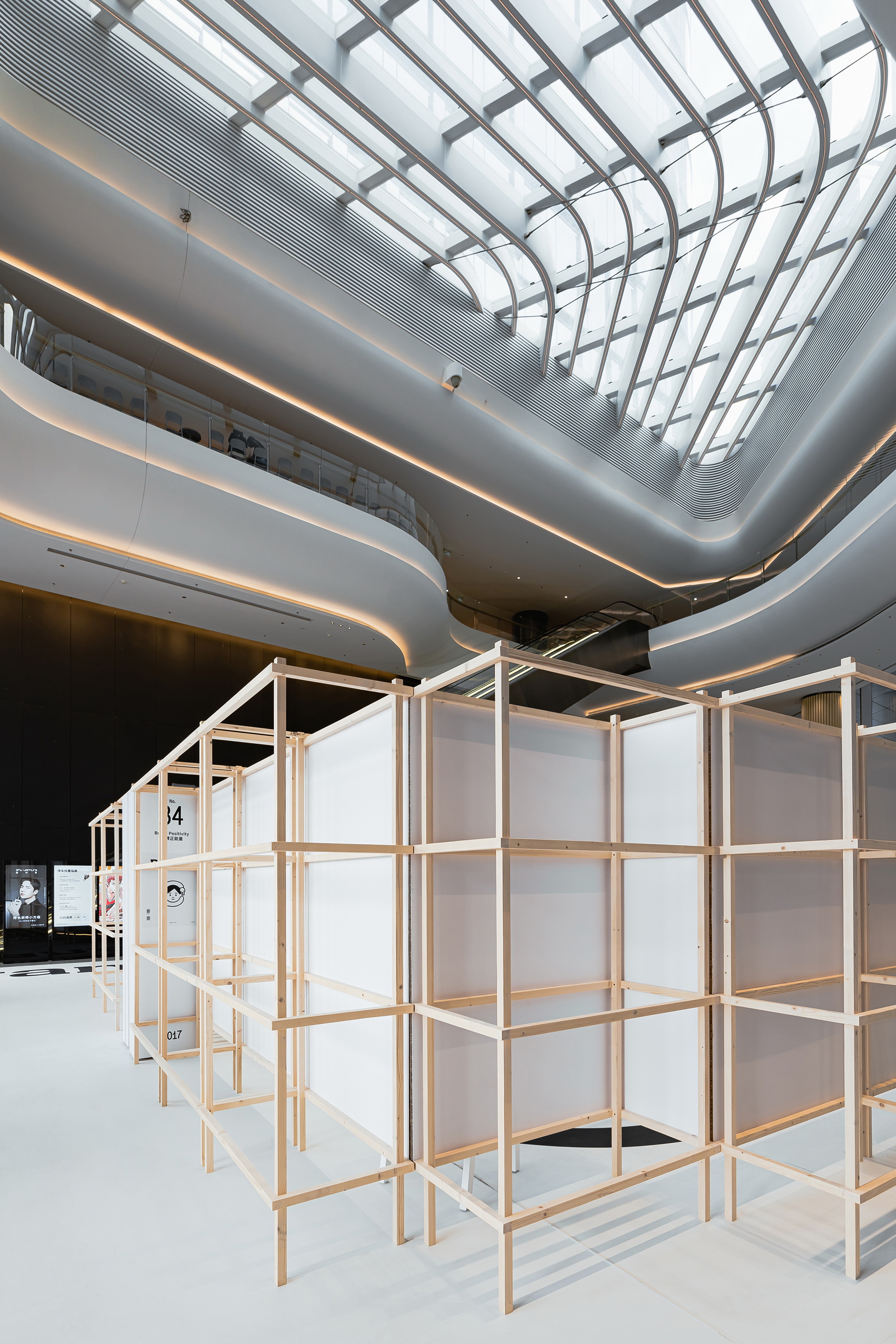
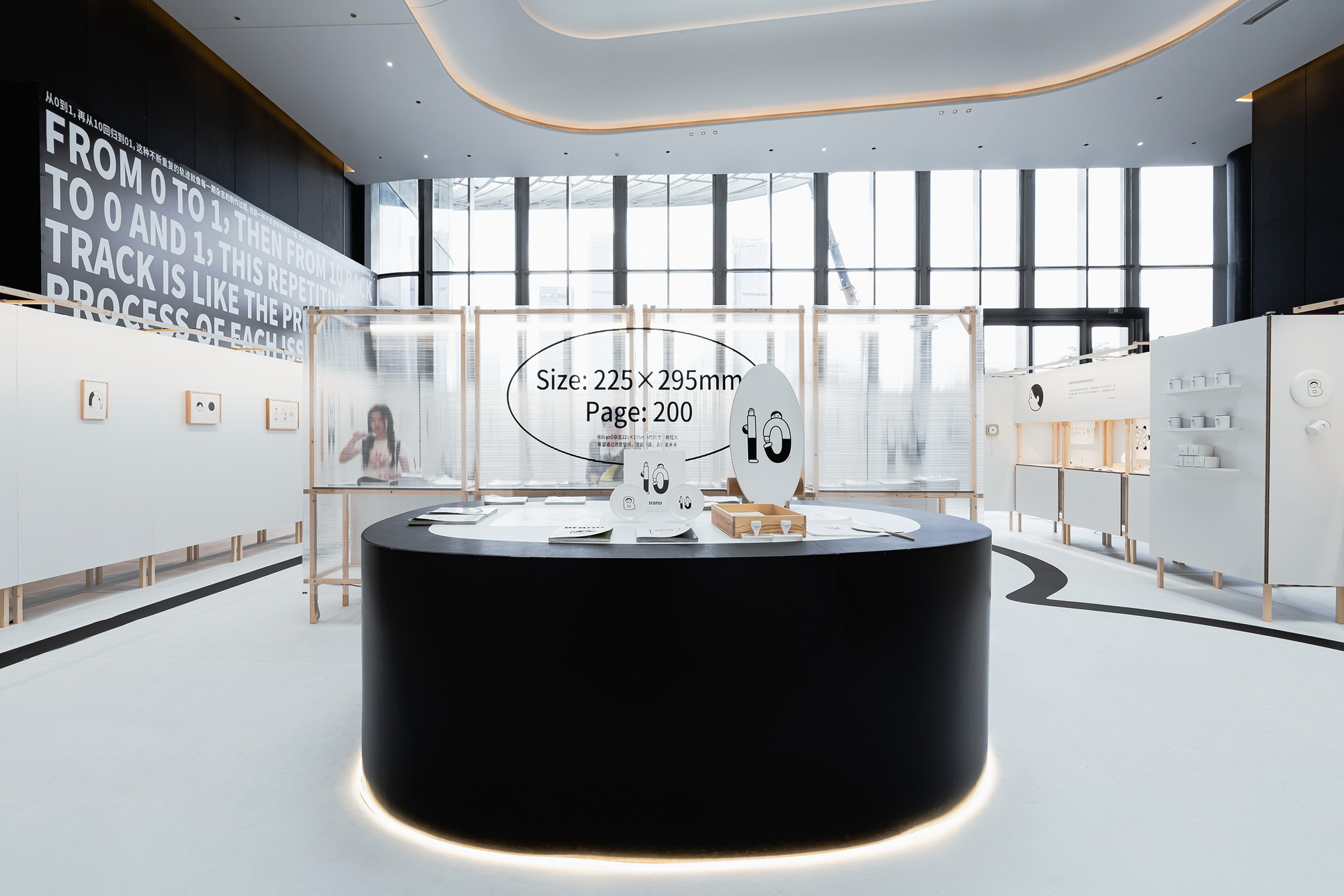
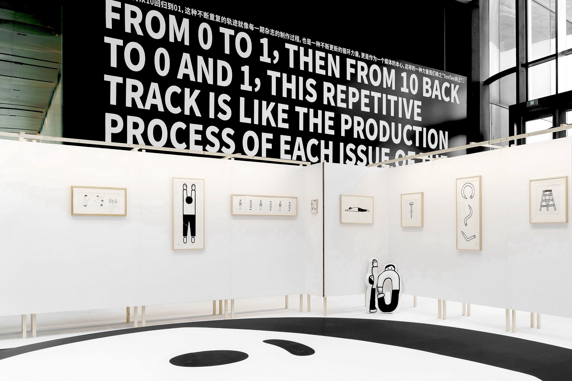
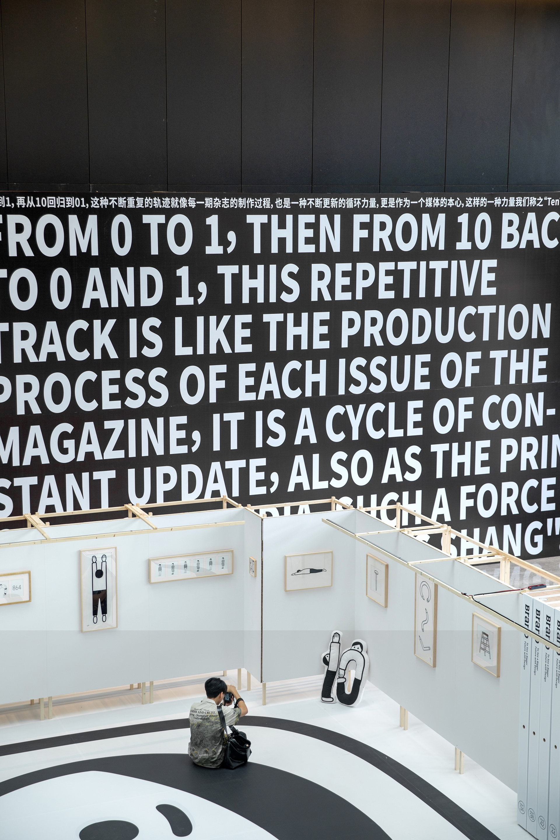
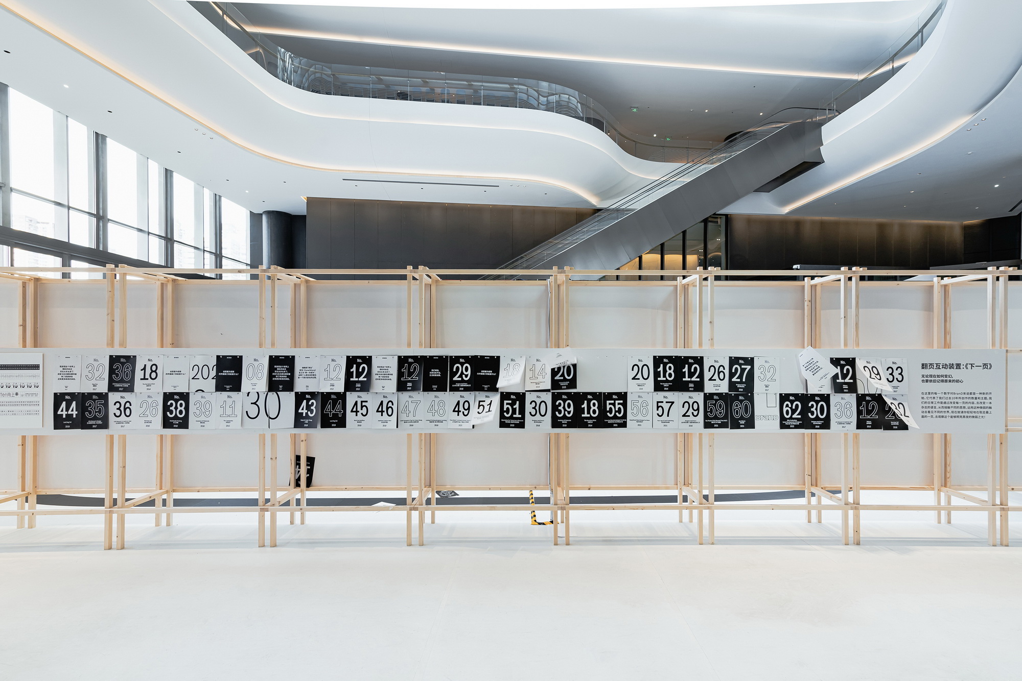
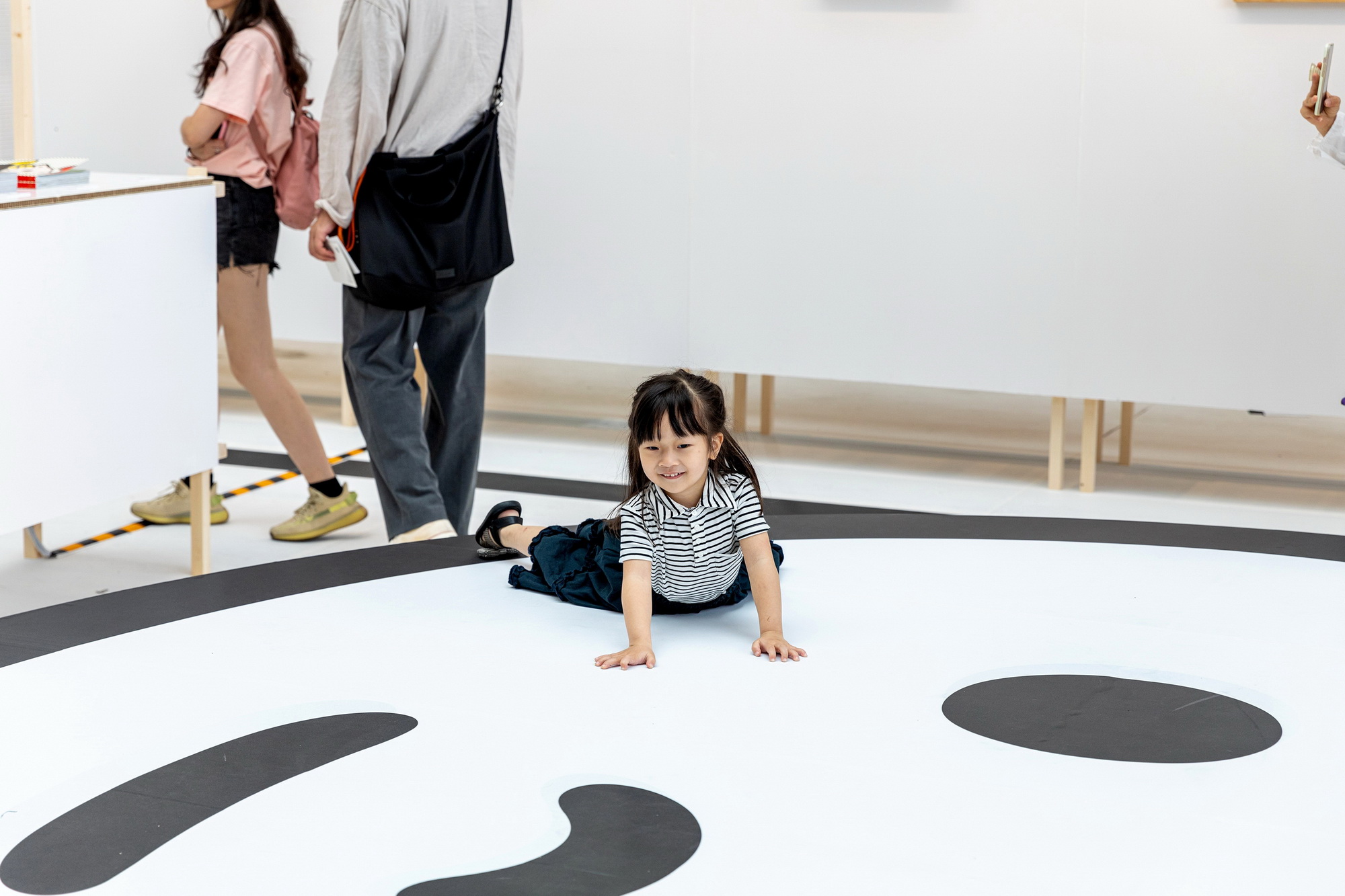
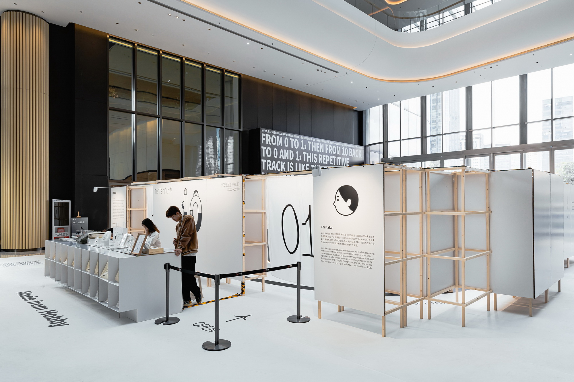
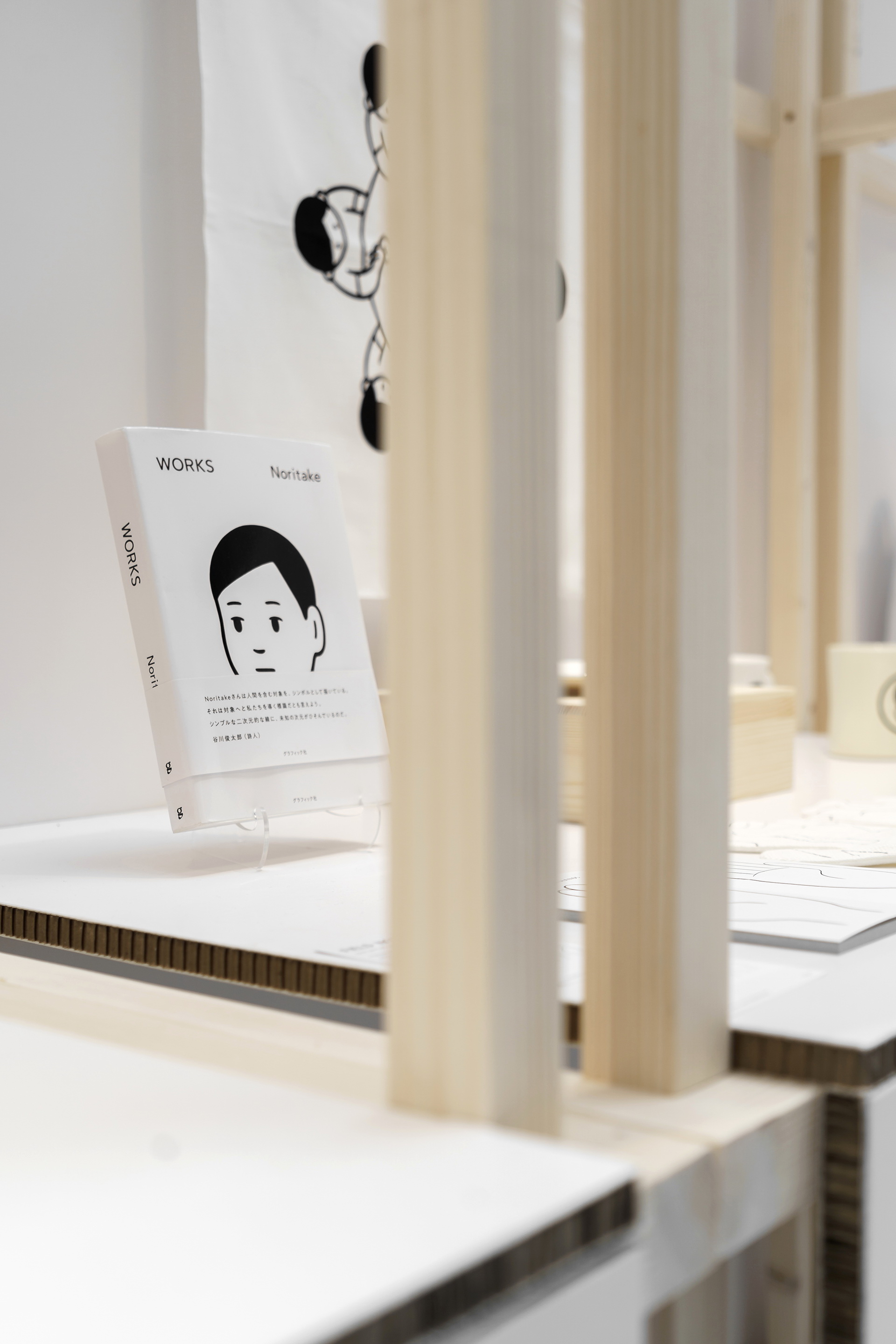
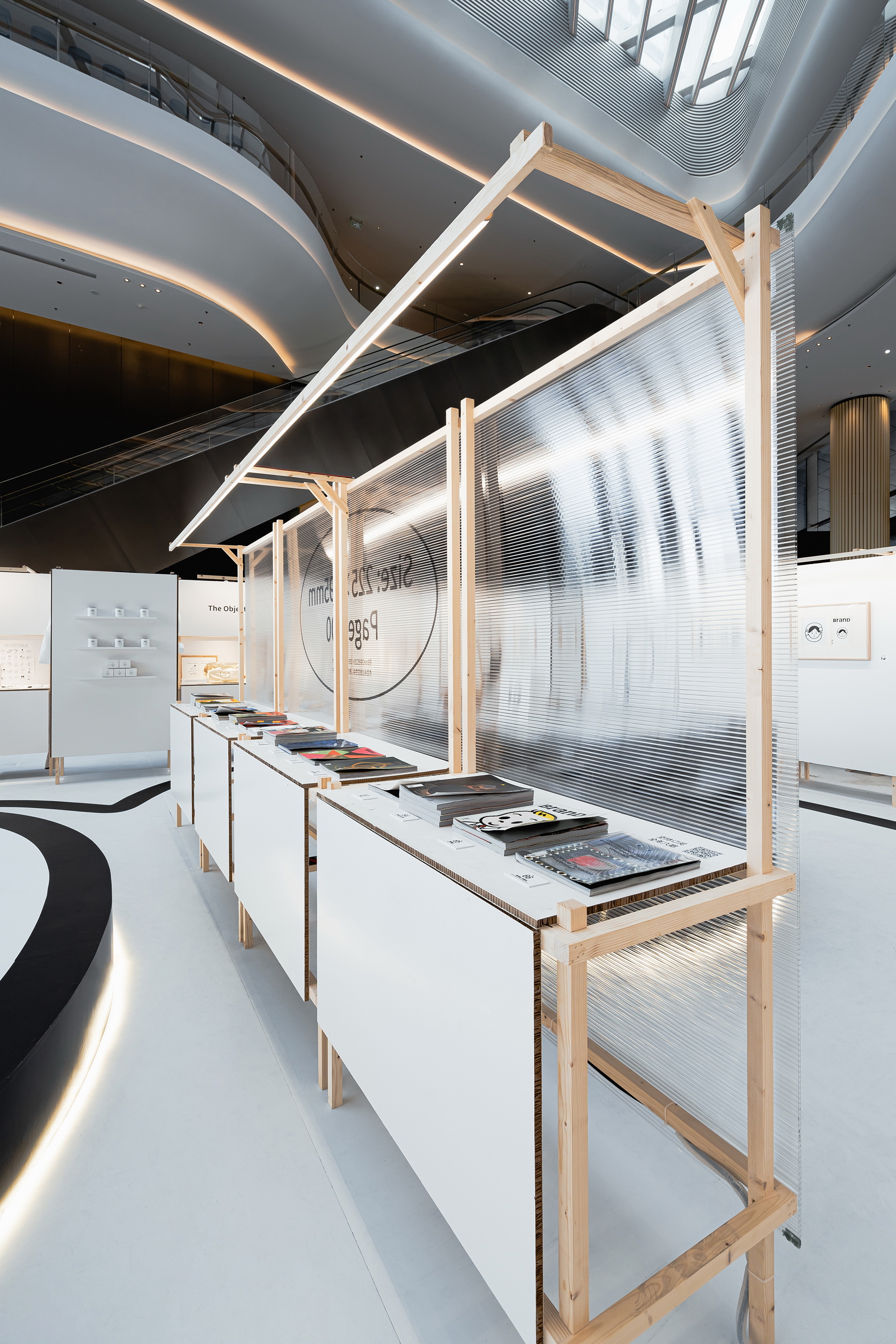
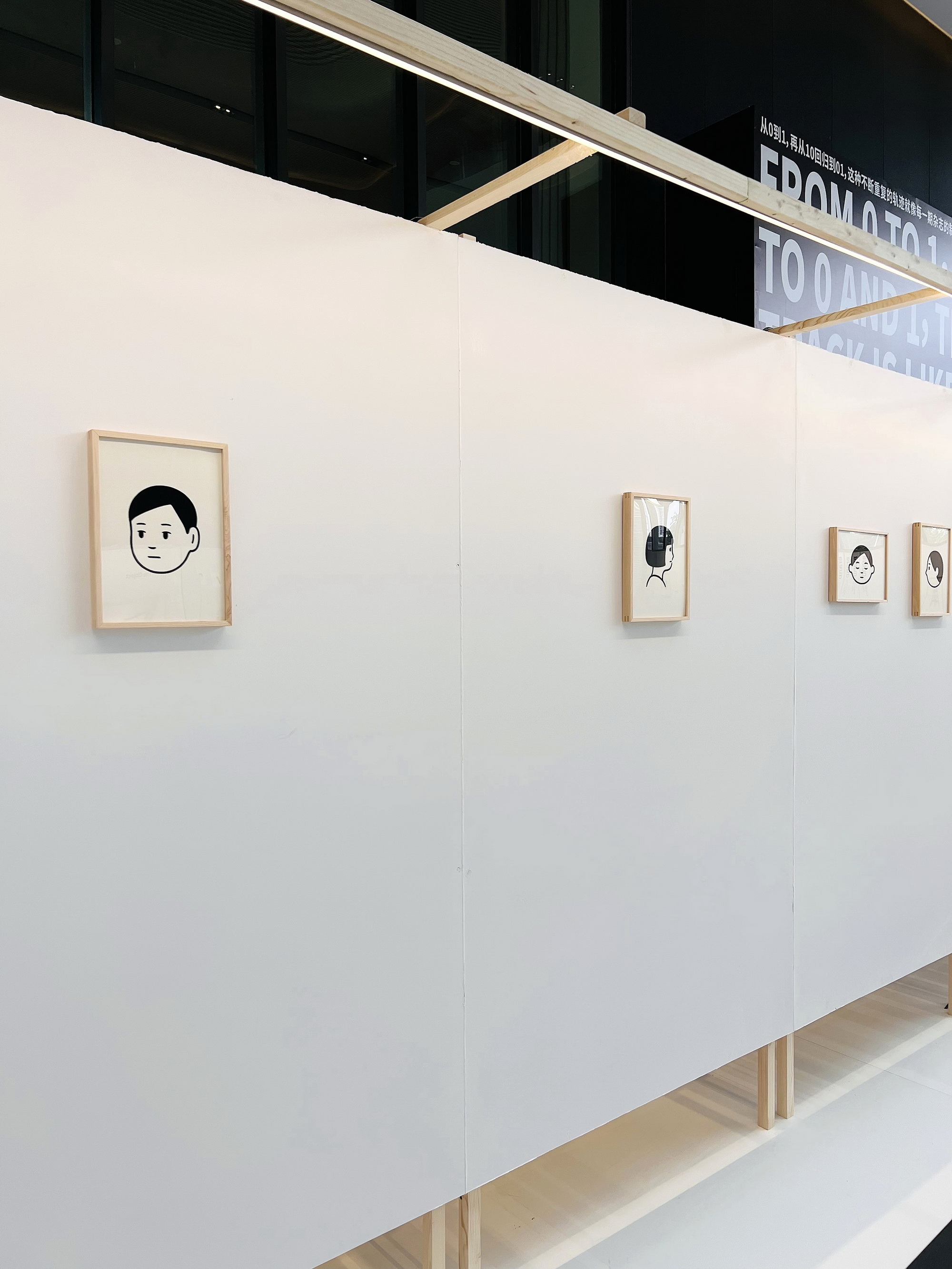
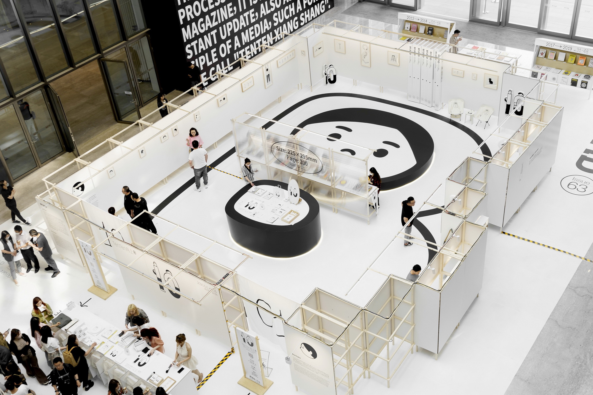
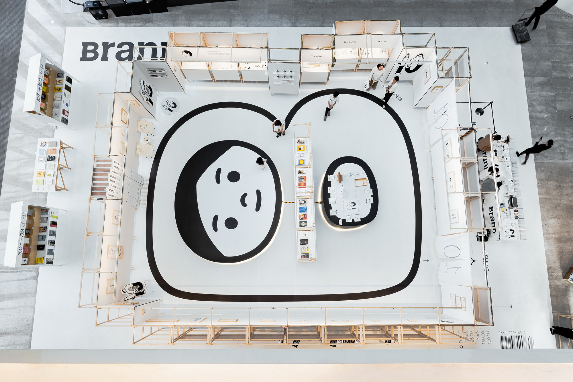
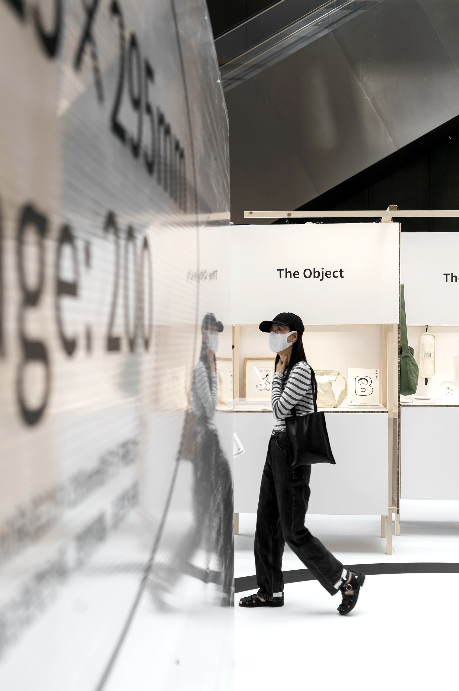
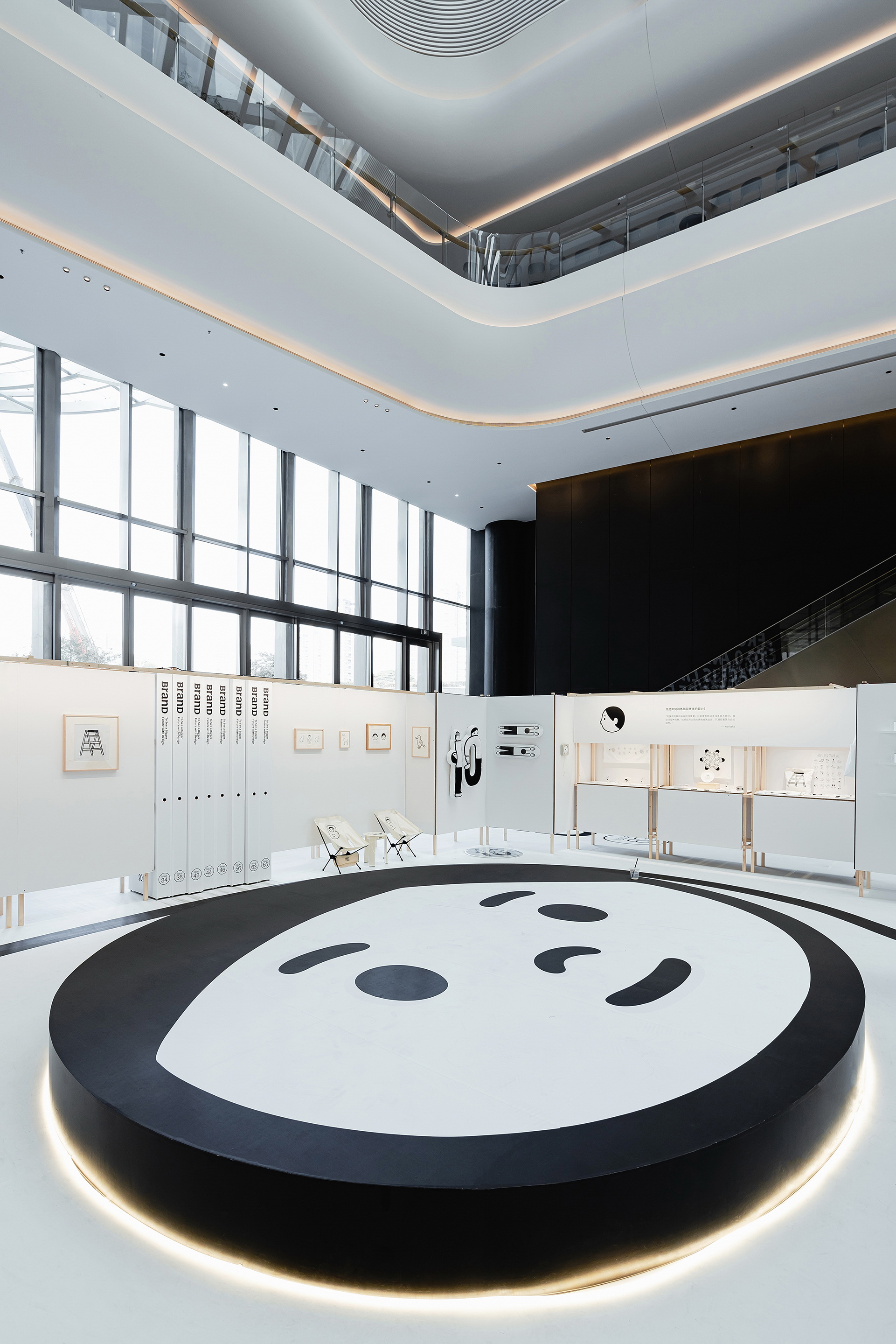
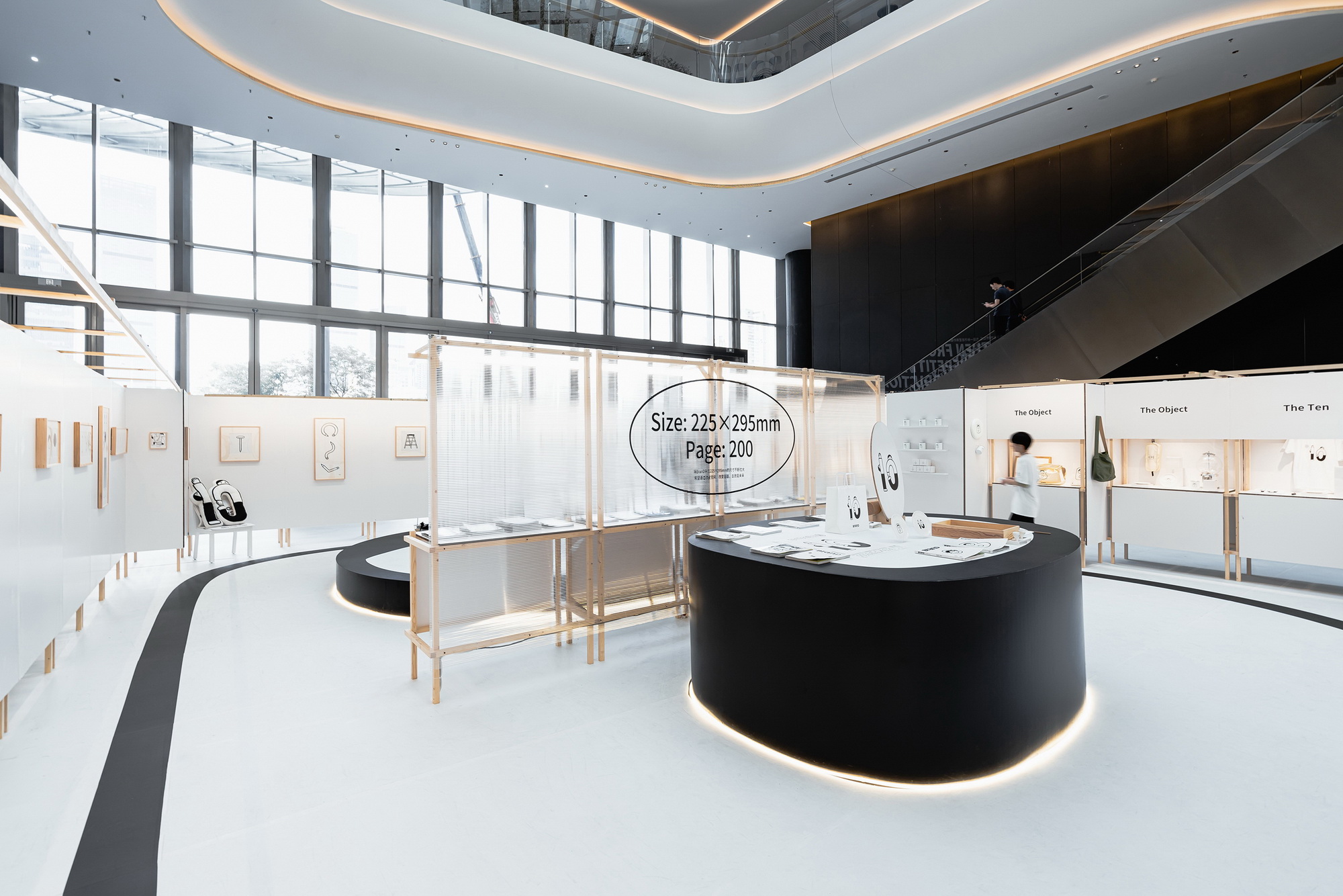
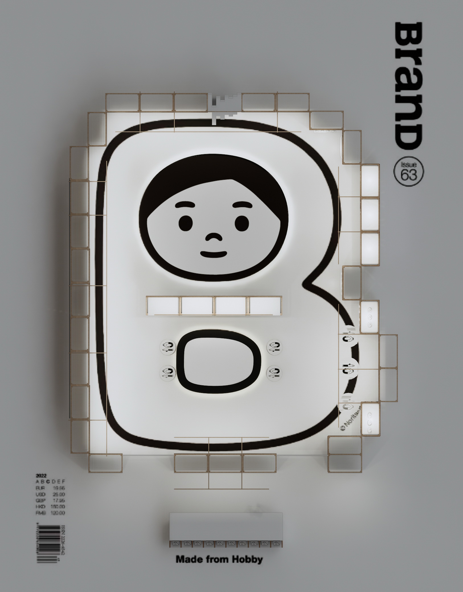
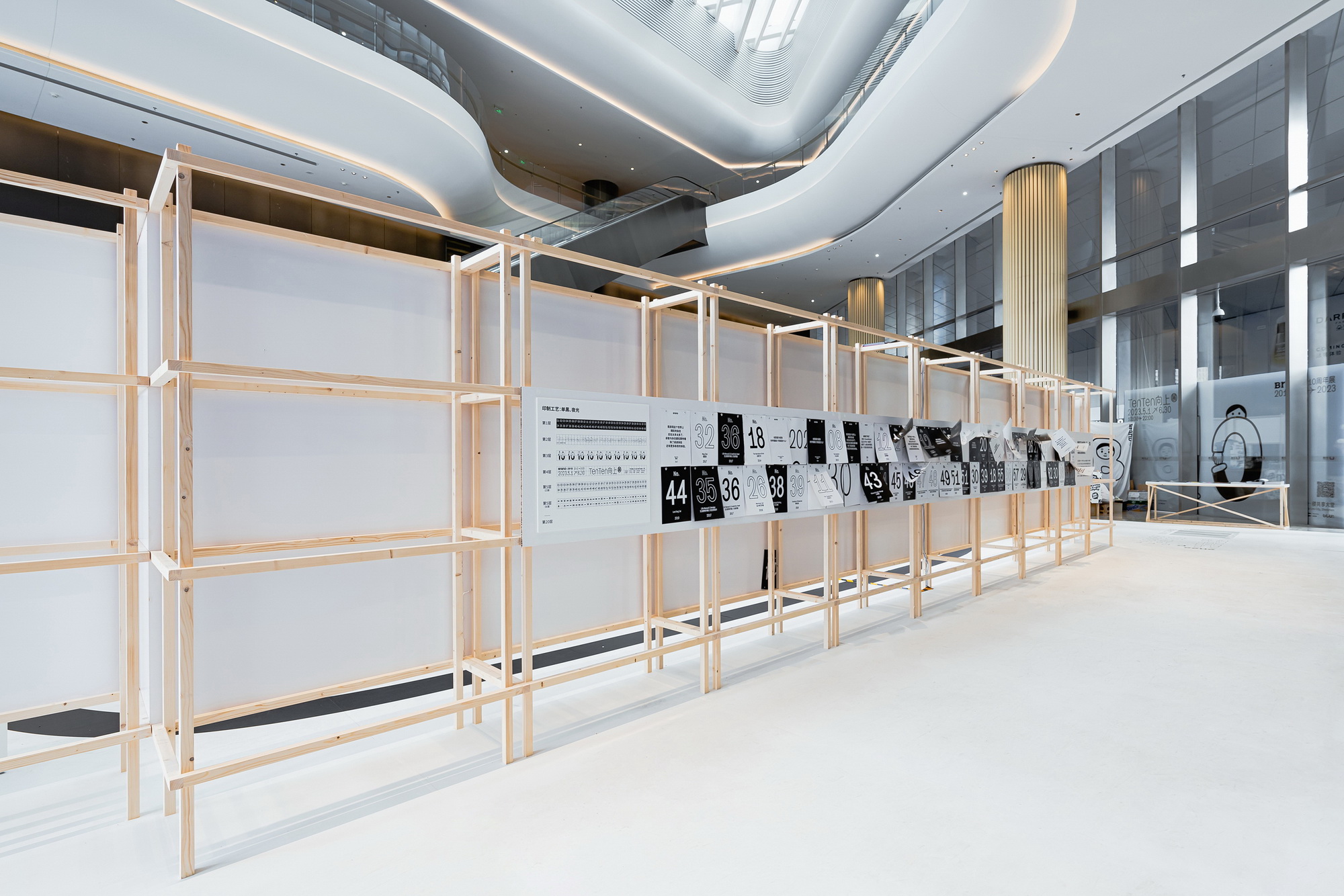
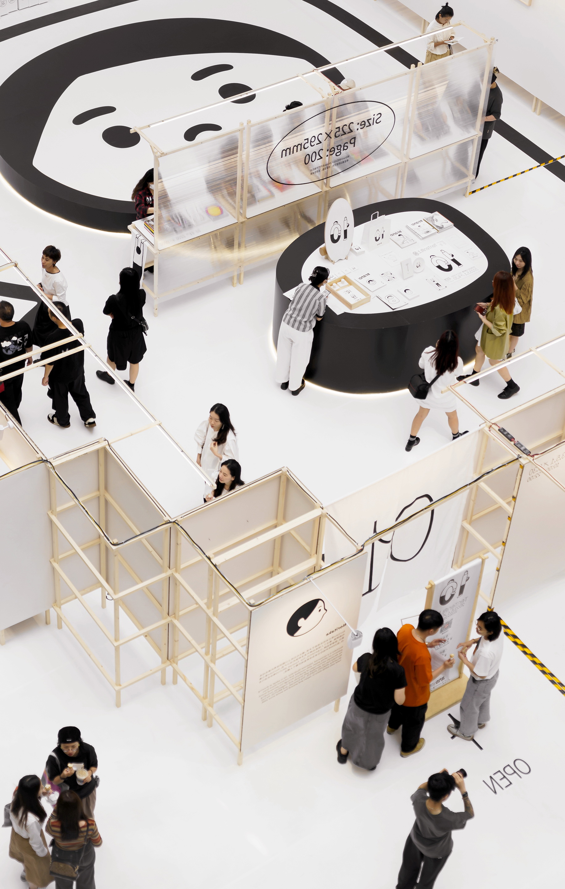
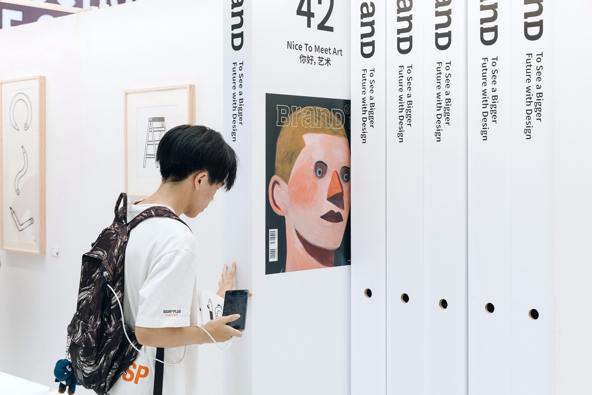
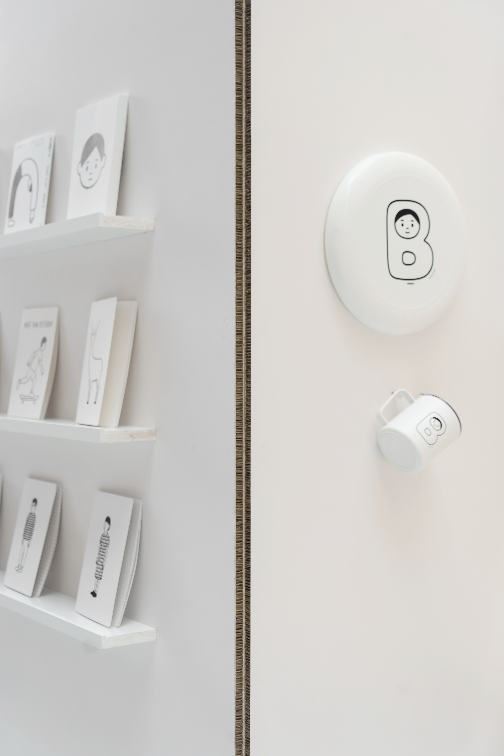
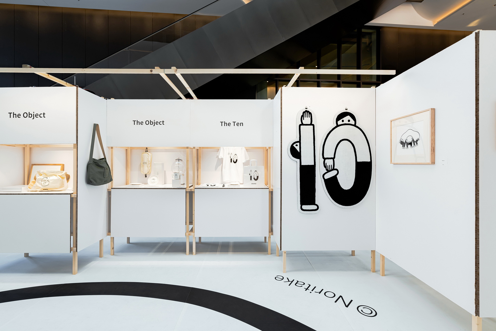
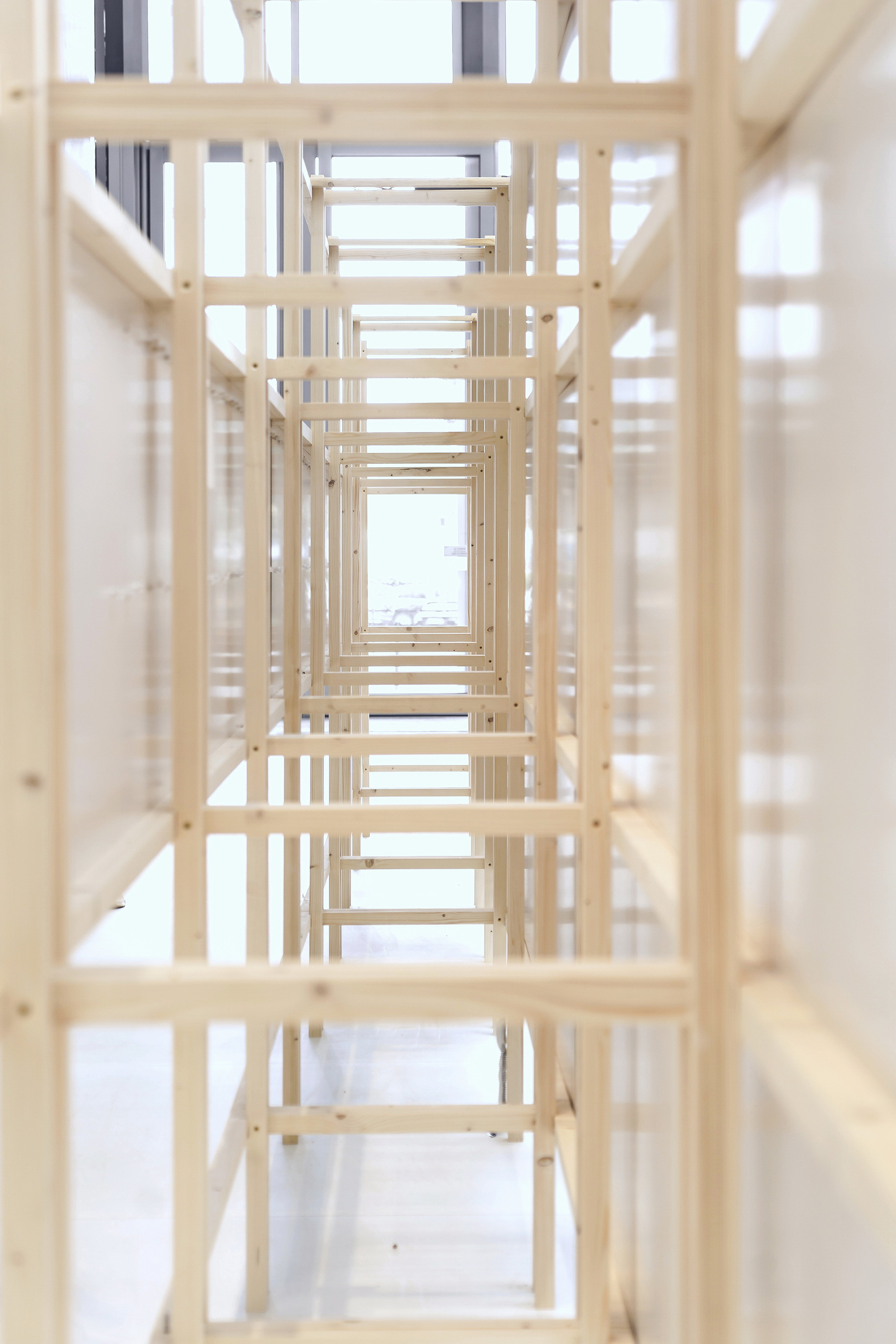
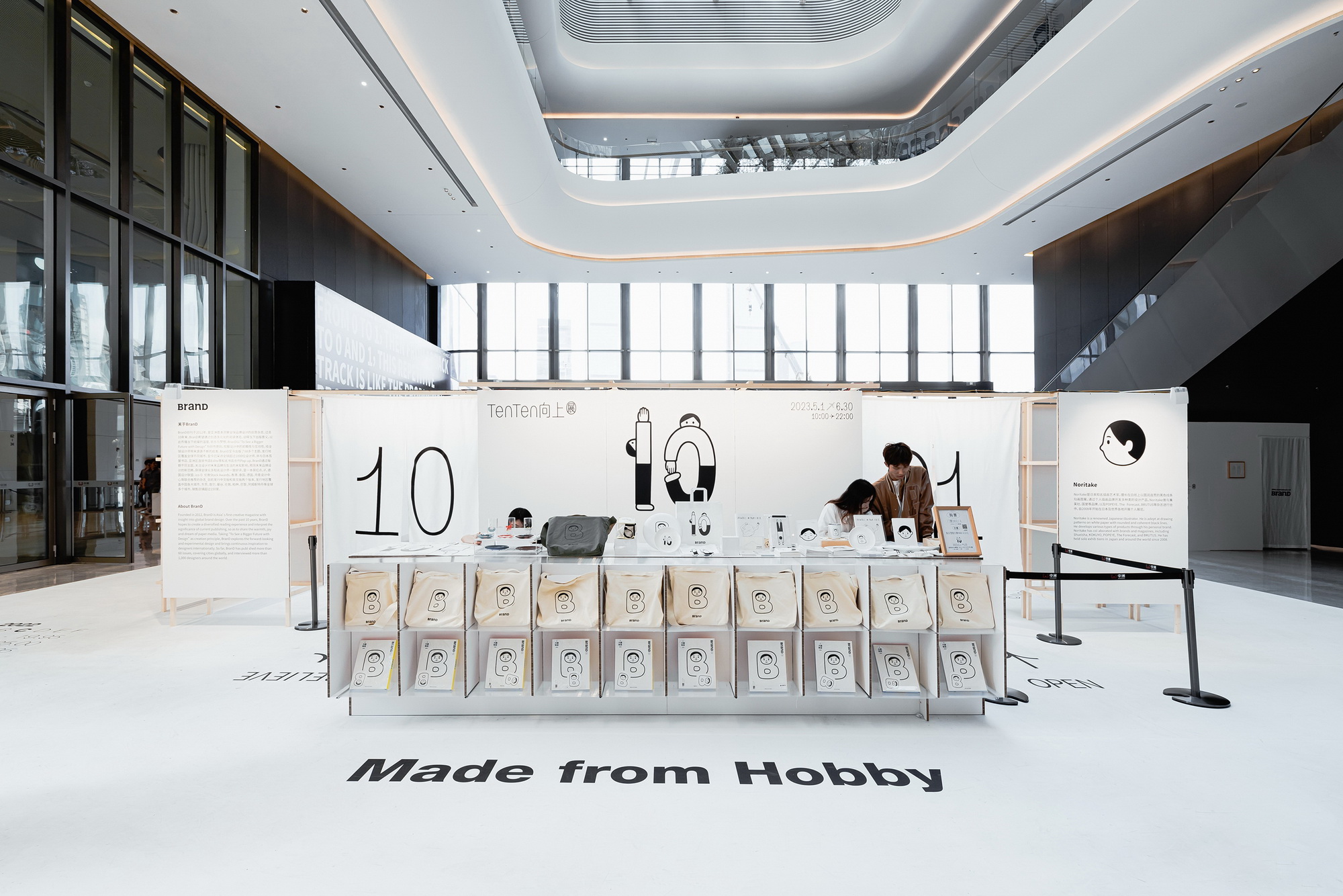
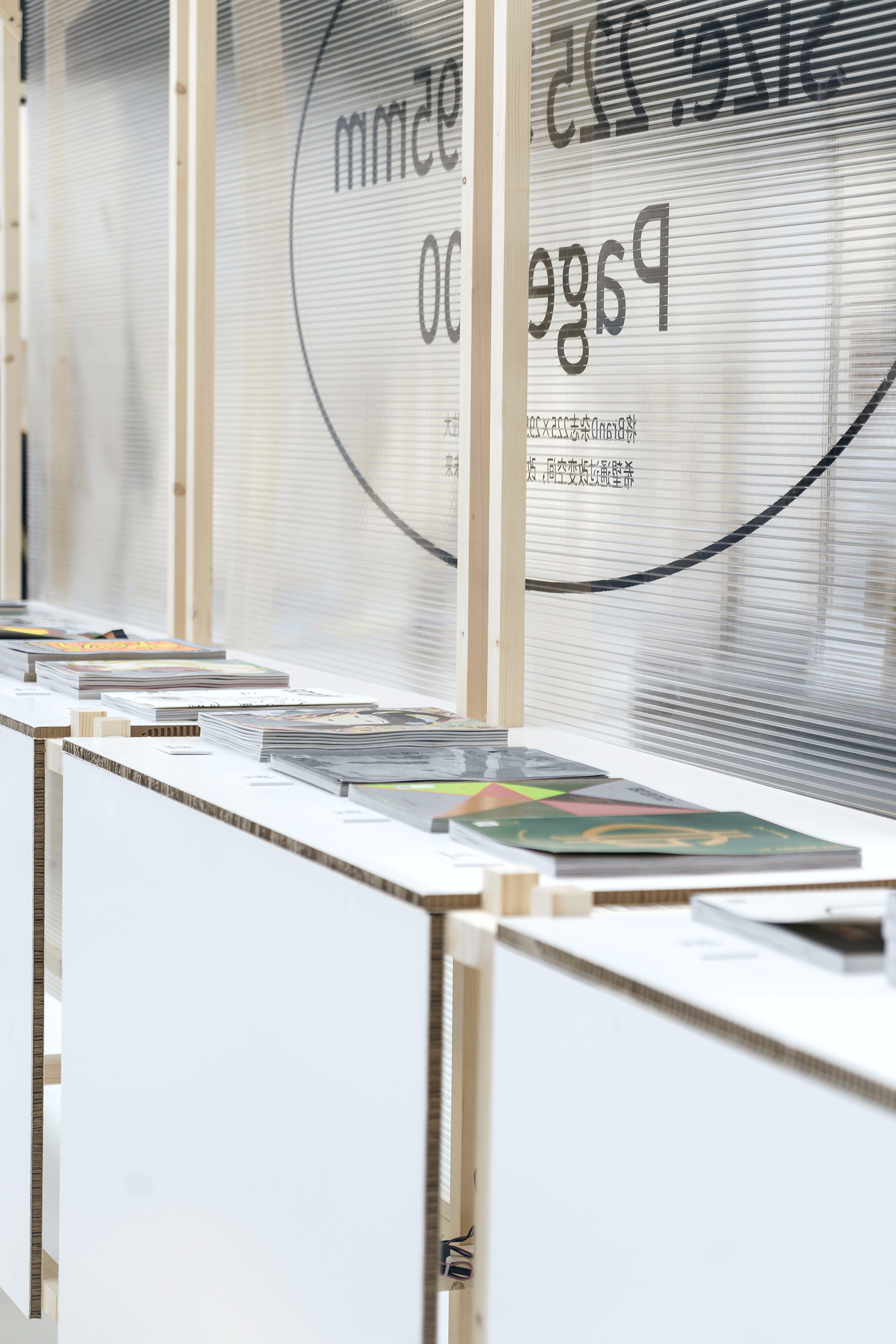
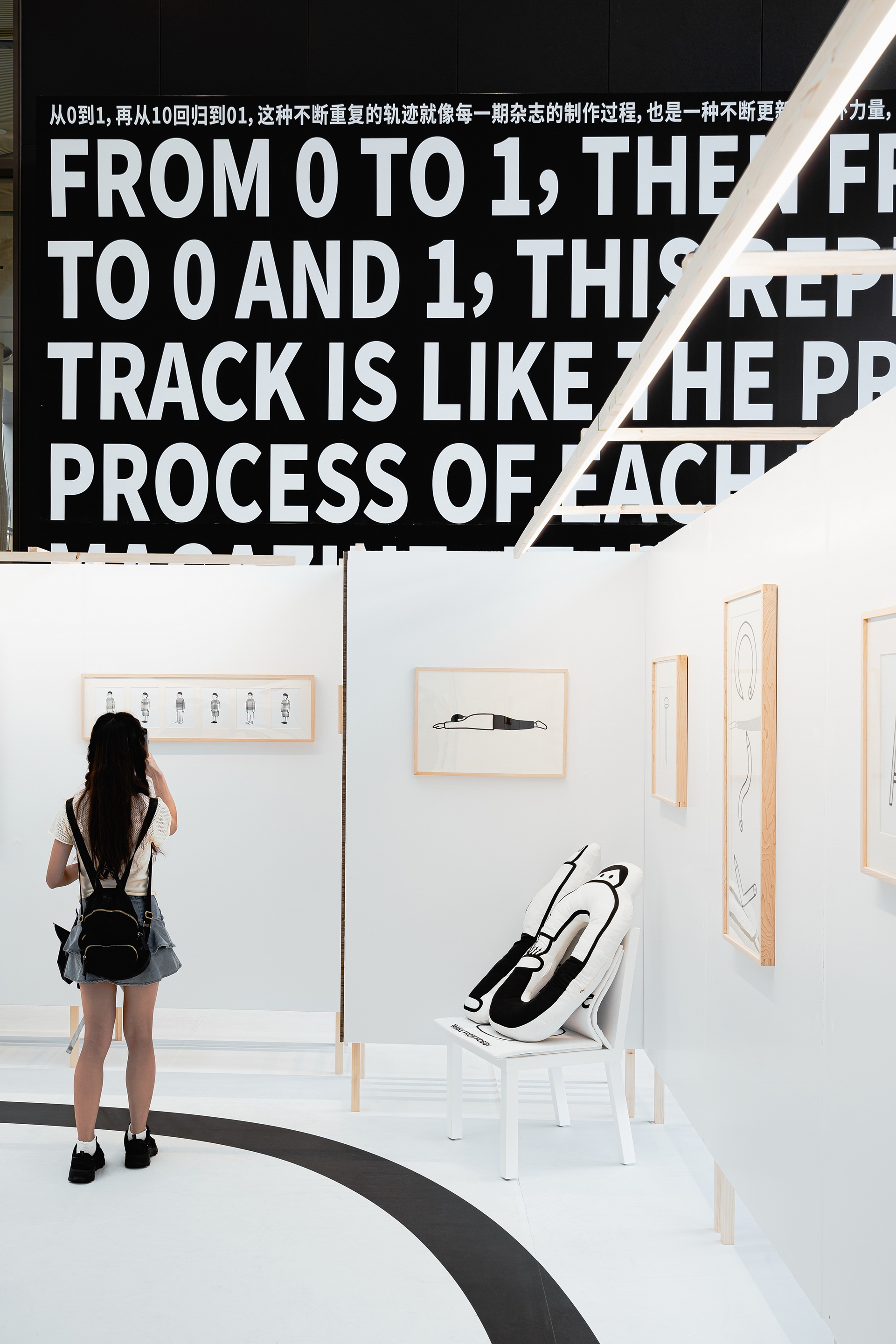
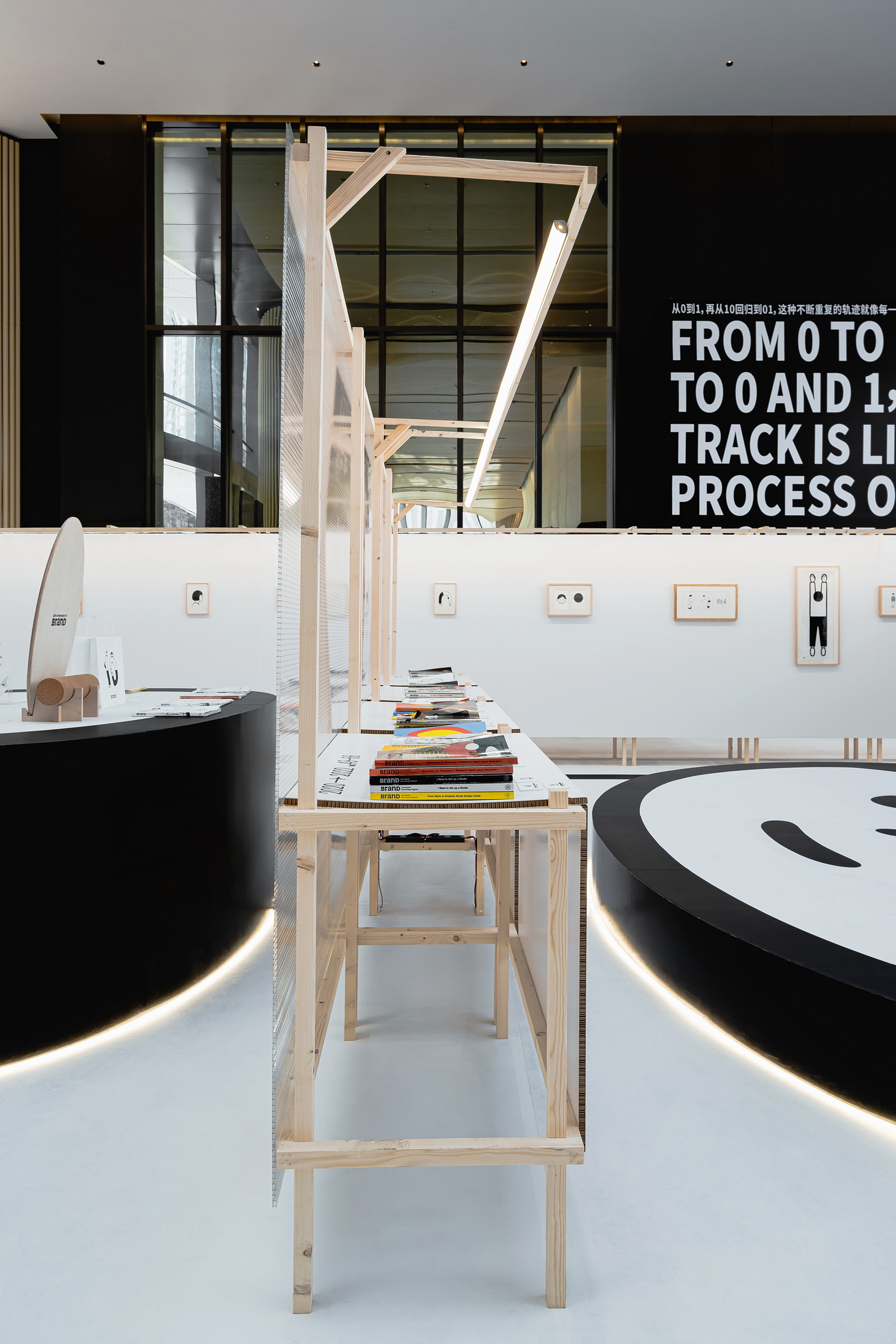
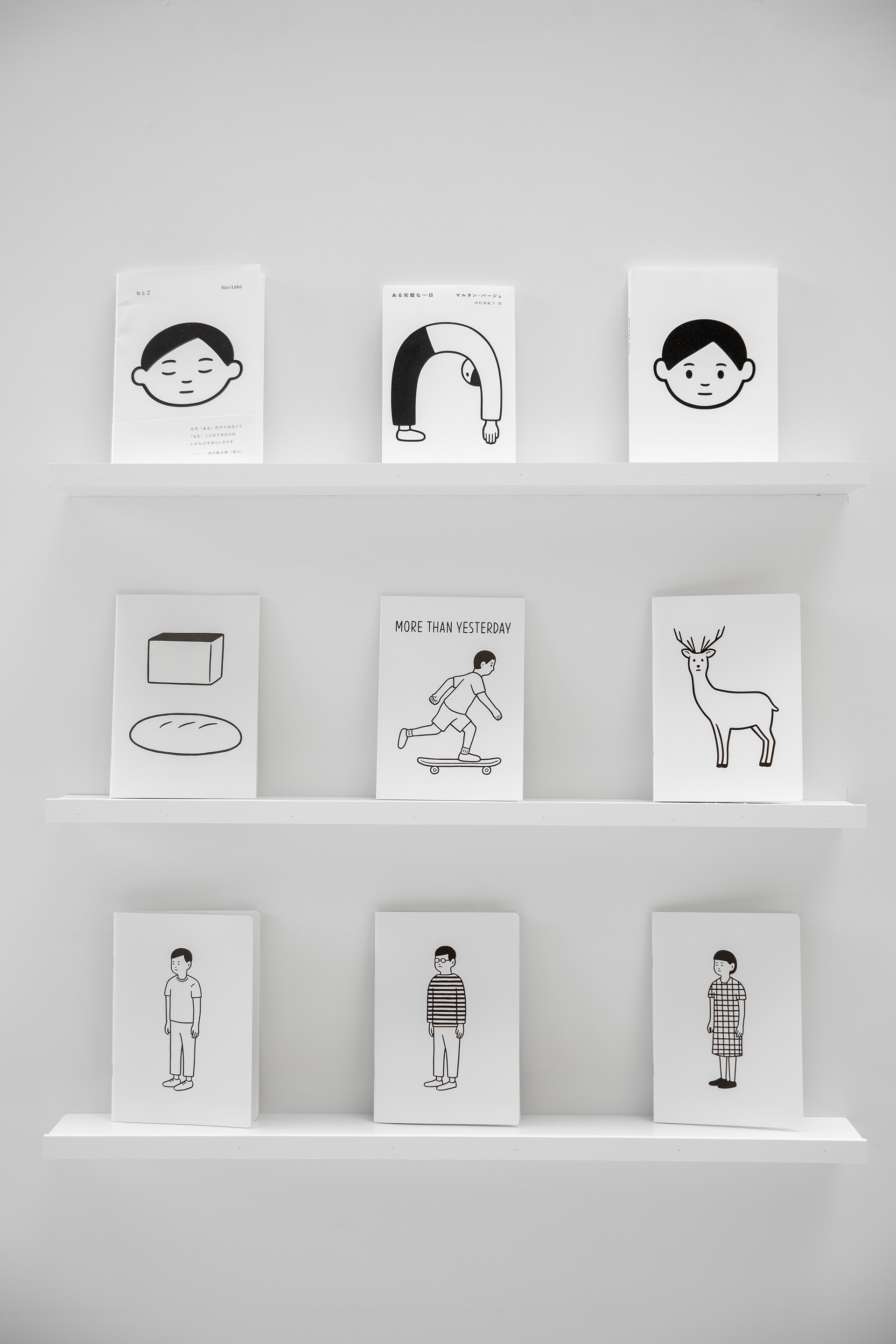
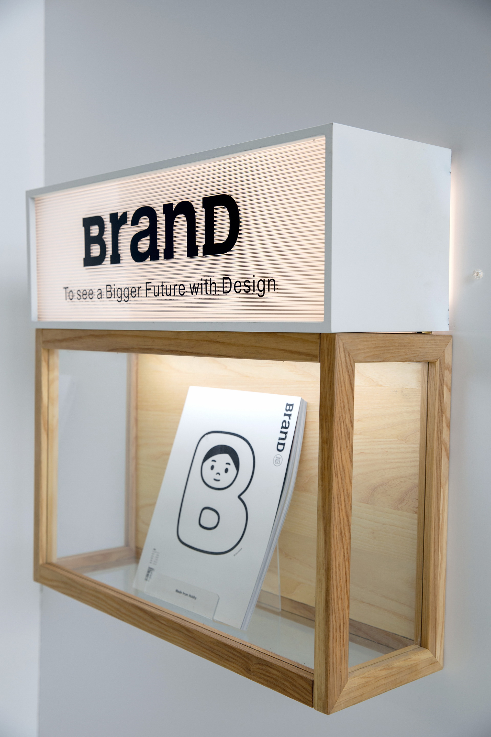
Aerial view of BranD 10th Anniversary Exhibition As a pioneering design magazine having been circulated in China for 10 years, BranD is regarded as a guide to graphic design trends by designers and readers alike. BranD delivers inspiration and fresh perspectives to domestic designers with cutting-edge and experimental designs under different themes, and introduces Chinese design to overseas counterparts. Aerial view of BranD 10th Anniversary Exhibition To celebrate its 10th anniversary, BranD collaborated with renowned Japanese illustrator Noritake to present its first anniversary exhibition in Shenzhen, which features its development history and efforts to achieve its dreams. Daxing Jizi Design, the designer of the exhibition, tried to interpret “constant renewal” and “upward spiral” with a space growing from plane. Info desk Interior of the exhibition Exterior framework with interactive installation 01. 01. From Magazine to Exhibition A Transformation from Plane to Space A Print Proof of BranD No. 63, "Make From Hobby", 2022 The design of the exhibition space was inspired by the cover of BranD No. 63, entitled “Make From Hobby”. For this issue, Noritake created an illustration of the letter “B” showing a child looking out of the “window” with curiosity, which embodies the desire to observe and record with a playful and innocent attitude. The phrase “Make from Hobby” is a perfect summary of BranD’s ten years of interest-driven journey, and a cornerstone for the spatial design. We intended to convey such values and create an intriguing space with aesthetic value that provoke the audience’s curiosity and desire for discovery. Exhibition design rendering 6m × 20. We transformed the magazine into an exhibition space. The magazine, measuring 225 × 295mm, is stretched upwards and enlarged from the 2D print media into a space of 15. 6 × 20. 5m, allowing visitors to walk into Noritake’s huge illustration and become a part of it. In the space, they can learn about BranD’s story over the past 10 years while enjoying the peaceful and relaxing space. When looking down from a higher position, the exhibition seems to be a 2D magazine again. 02. 02. Leave a Blank A Minimalist Space Strategy Occupying an area of 320 square meters, the exhibition is placed in the F1 atrium of a commercial complex with convenient access enabled entrances of the mall, corridors elevators and escalators. Visitors are able to enjoy the exhibition from different heights and angles in the atrium space flooded with natural light. Floor decal installation We placed the exhibition in the center of the space, and the enlarged cover of BranD No. 63 was printed on a white matte floor decal covering the original parquet marble floor. The modular walls enclose the exhibition space around the letter “B”, with passages on the outside. The growth of space In the exhibition space, the two circular parts of the letter B are designed as platforms with different functions, separated by a translucent “screen”, skillfully resolving the limitations arising from the transformation from plane to space with subtle and refreshing changes. Internal structure of the exhibition In an adaptable approach, the exhibition is well incorporated into the building and creating a peaceful and inviting space amid the bustle. 03. 03. A Dialogue Between Paper and Wood A Journey Towards Sustainability With No Excessive Decoration The modular walls are made of Finnish pine wood well matched with the naturalistic picture frames and recycled white honeycomb cardboard mirroring Noritake’s minimalist illustrations. We strive to make the most of the materials to reduce their use as much as possible. As sustainable materials, wood and paper enable best recyclability to reduce the environmental impact effectively. Exhibit walls made of paper and wood Exhibit walls made of paper and wood A relaxing and sensory-friendly space created with paper and wood The exhibit walls and platforms made of white honeycomb cardboard are visually neat and consistent, setting off the exhibits with ample blank space. On the exterior surface of the walls, the supporting wooden structure are exposed to create an eye-catching contrast with the cardboard. The interaction between natural materials and the simplicity, sustainability of the installation is a structural interpretation of “no excessive decoration”. Exhibit walls made of white honeycomb cardboard Consistent white walls for artwork display Wooden framework exposed on the external side A design with“no excessive decoration” brings an eye-catching contrast When we were invited to design the exhibition space, we immediately decided to choose "paper" as one of the main materials. Print media practitioners are among the few people who still know the characteristics of paper. Although the number of people preferring paper reading is plunging due to the rapid development of social media, paper is still a material with extraordinary vitality due to its unique characteristics. It’s an essential material for magazine printing, and Noritake presents his simple and adorable illustrations on white paper. Exhibit wall made of cardboard Paradoxically, paper serves as a traditional way for information preservation, yet it is very easy to “disappear”. Paper books can survive for thousands of years in proper conditions to carry forward history, culture and countless stories. Paper also has advantages for temporary use: it is fine, lightweight, inexpensive, and easy to cut, with well-established recycling and reuse systems. Material: Details of Paper For the two-month exhibition, we hope to reduce waste as much as we can, and “paper” is an ideal material to minimize the environmental impact of the exhibition. Material: Details of Paper We chose a light-colored Finnish pine wood for the framework of the exhibit walls. Grown in a cold climate, Finnish pine wood has a fine, soft color and a smooth, unpretentious texture that works beautifully with paper panels. The unique quality of wood is highlighted with exposed parts of the framework, while its clear, streamlined structure conveys a sense of reliability. Wooden Framework Material: Details of Wood The simple yet attractive structure is meant to evoke awareness in visitors: Social interactions can be daunting and make people feel anxious. Can we communicate as simple and straightforward as the structure – No more speculation and possible offense, and we always feel comfortable and relaxed when we engage each other. Interactive installation “Next Page” on the external framework A relaxing atmosphere 04. 04. Derivation of Structure Flexible Modular Design Just as magazines evolves continuously with its many issues, the pixel-like modules of exhibit walls enable full adaptability to diverse exhibits and varied needs by generating a changeable structure through simple replication and combination. The exhibition space structure formed by module Moreover, when setting up the exhibition space, the flexibility of the modular design allows for quick adjustments and creation of display platforms, bookshelves, sales stands, and even staff passages with temporary doors. Modular wall prototype Display platforms The LED light strip is hidden for a soft lighting effect In line with the principles of sustainable design, the lightweight modules allows for quick and easy installation. The rods in different sizes can be easily fabricated and transported. After determining the size and shape of the exhibit walls, it took only a few hours for two workers to complete the installation of the whole project. When the exhibition ends, the modules can be disassembled and reused in the same simple way. A screen made of four modules Details of the Screen Our modular design allows for a flexible and adaptable structure for an efficient and sustainable exhibition solution. The meticulous attention to installation detail also provides pleasure surprises to visitors. A big “magazine” placed in the wall BranD No. 63 at the back of the exhibition space 05. 05. The Joy of Wandering




 Editor's Pick
 Latest Design